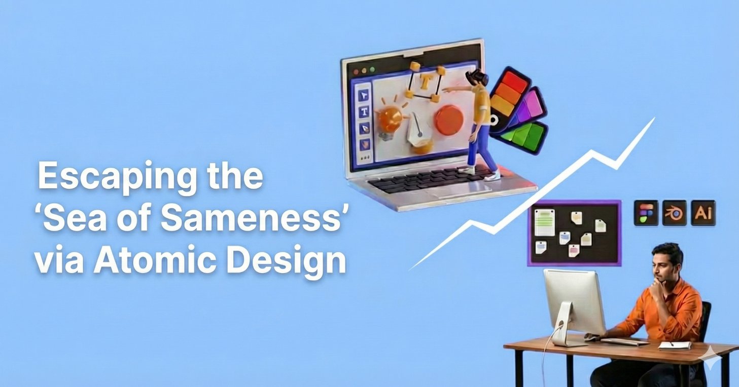
Open an incognito window. Type in three of your competitors’ URLs. Notice anything?
The hero banner that spans the full width. The three, column product grid. The “Sign up for 10% off” popup that appears after exactly four seconds. The testimonials carousel. The Instagram feed in the footer. Your site looks professional. Clean. Modern. And completely interchangeable with everyone else in your category.
Welcome to the Sea of Sameness.
In the race to digitize, thousands of brands took the same shortcut: premium Shopify themes and template based designs. It made sense. These templates are polished, responsive, and relatively affordable. They let you launch fast.
But now everyone launched fast to the exact same destination. When every skincare brand, sneaker company, and coffee roaster uses the same UI patterns, you’ve accidentally commoditized yourself. Design was supposed to differentiate you. Instead, it made you invisible.
And when you’re invisible, price becomes the only differentiator.
At PracticeNext, we’ve seen this pattern kill brands that should have won. Great products. Strong margins. Solid marketing. But their storefront looked like it came from the same factory as their competitors. So customers treated them like commodities.
Here’s the problem: you can’t escape this trap with another redesign. You’ve probably already tried that. You need something more fundamental.
You need a Design System built on Atomic Design.
The Hidden Tax You’re Already Paying
Let us show you what Design Debt looks like.
Your homepage has a button. Clean, modern, with a 4px border radius and a subtle hover effect. Perfect.
Your Black Friday landing page has a button too. Same label, same function. But this one has sharp corners. 0px border radius. Someone on the agency team built it three months after the homepage and didn’t check the specs.
Your email template has a button. It’s the same blue, or is it? Actually it’s #0052CC instead of #0056D2. Close enough that no one consciously notices. Different enough to create subconscious friction.
Multiply this by every element across your site. Buttons, form fields, typography, spacing, icons, colors. Dozens of tiny inconsistencies that compound into visual chaos.
This isn’t just an aesthetic problem. It’s a revenue problem.
According to Lucidpress, consistent brand presentation across all platforms increases revenue by up to 23%. When customers encounter visual fragmentation—even subtle variations they can’t consciously articulate—they perceive unreliability. Your site feels amateur. Untrustworthy. Slightly off.
They bounce to a competitor whose site feels more coherent.
And there’s an operational cost too. Without a system, your designers spend 50% of their time “pixel pushing”, debating what a button should look like, how much padding a card needs, which shade of blue to use. They’re reinventing the wheel on every project instead of solving actual user problems.
Every landing page is a one off. Every campaign asset starts from scratch. Every new feature requires design discovery as if you’ve never designed anything before.
It’s expensive. It’s slow. And it’s completely unnecessary.
The Way Out: Build Components, Not Pages
Here’s the mental shift that changes everything.
You don’t build a Digital Flagship page by page. You build it component by component.
This methodology is called Atomic Design, coined by Brad Frost. It’s borrowed from chemistry: complex things are made of simpler things, all the way down to fundamental elements. Your interface works the same way.
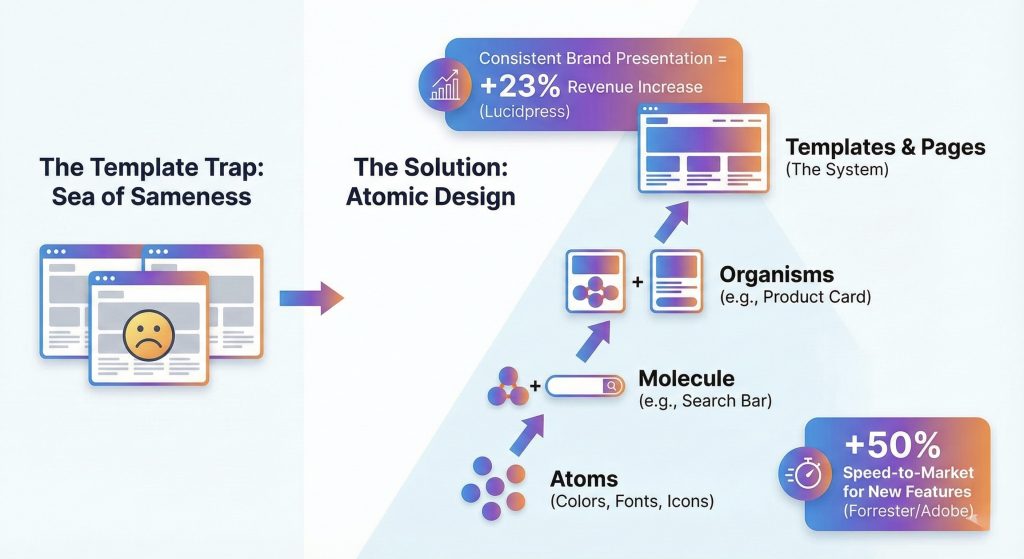
Atoms: The Elements
These are the foundational building blocks that can’t be broken down further in your interface.
A color value: #0056D2. A font weight: font-weight: 600. A single icon. A button shape. A spacing value: 16px.
The atoms are your rules. Your design DNA. The non-negotiables.
The power: When you change the “Primary Color” atom from blue to green, it updates everywhere instantly. Every button. Every link. Every accent element across your entire site. One change, universal impact.
Molecules: The Functional Units
Atoms combined to form a simple functional component.
A search bar molecule = Input field (atom) + Search button (atom) + Magnifying glass icon (atom) + Label text (atom).
Build it once. Use it everywhere. The search bar in your header is identical to the search bar on your 404 page and your account dashboard. Same behavior, same appearance, zero inconsistency.
Organisms: The Sections
Molecules and atoms joined to form a distinct section of your interface.
A product card organism = Product image (atom) + Product title (typography atom) + Price (atom + color atom) + “Add to Cart” button (molecule).
Now you can stack these organisms like building blocks. Product card + Product card + Product card = Product grid. Rearrange them. Resize them. Combine them in new ways. The components are modular and infinitely flexible.
Templates & Pages: The Final Assembly
This is what users actually see. But you’re not designing from scratch anymore. You’re arranging pre-built, tested, approved components into new layouts.
It’s the difference between carving a chair from a tree trunk versus assembling furniture from engineered parts. Both can produce quality results. One is dramatically faster and more consistent.
The LEGO Moment
Let us show you what this looks like in practice.
Your marketing team wakes up Thursday morning with an idea: limited edition sneaker drop this weekend. We need a custom landing page. High-impact hero, product showcase, countdown timer, email signup. Can we have it by Saturday?
The old way:
Brief the agency. Wait for wireframes. Review. Revisions. Wait for mockups. More revisions. Dev handoff. Technical QA. Launch… three weeks later. The moment has passed. The campaign is dead on arrival.
The Atomic Design way:
Your developer opens your component library. Hero banner organism, check. Product grid organism, check. Countdown timer molecule, check. Newsletter signup organism, check.
They drag and drop. Adjust the content. Change the product images. Preview. Push live.
Three hours. Not three weeks. Three hours.
And it’s not a Frankenstein mashup. Every component is already brand consistent, accessibility compliant, and mobile responsive. Because you built them right once, and now you use them everywhere.
The data backs this up. Companies with robust design systems report a 50% increase in speed-to-market for new features, according to research from Forrester and Adobe. But the real competitive advantage isn’t just speed—it’s the ability to experiment rapidly.
When launching a landing page takes three hours instead of three weeks, you can test ten different approaches. You can respond to trends while they’re still trending. You can iterate based on real customer feedback instead of betting everything on one design that took too long to build.
Your competitors are still in the approval process. You’ve already launched, tested, and optimized.
Building Your System Without Burning It All Down
Here’s the good news: you don’t need to pause your business for six months to build a massive design system. You can do this iteratively, starting today.
Phase 1: The Audit (Weeks 1-2)
Gather every screenshot of your current site. Every page, every component, every variation. Dump them all into a virtual whiteboard: Miro, FigJam, whatever you use.
Now look at them together. Really look.
How many different button styles do you have? How many shades of blue? How many font sizes? Prepare to be horrified. Most brands discover they have 14 different typography scales, eight “primary” buttons, and six different shades of what was supposed to be the same red.
The goal: Identify the chaos. Surface the inconsistencies you’ve been subconsciously tolerating.
The action: Kill the outliers. Consolidate ruthlessly. You don’t need 14 font sizes, you need five. You don’t need three different card styles—you need one excellent one.
This is painful but necessary. You’re excavating the design debt you’ve accumulated.
Phase 2: Define Your Design Tokens (Week 3)
Design tokens are the code variables for your brand’s DNA. They’re the atomic foundation of your system.
color-primary: #0056D2
color-secondary: #1A1A1A
spacing-small: 8px
spacing-medium: 16px
spacing-large: 24px
font-header: 'Helvetica Neue', sans-serif
font-body: 'Inter', sans-serif
border-radius-default: 4px
These are your non-negotiables. Your design decisions, codified.
The win: When you rebrand next year, or when your CEO decides she hates that shade of blue, you change these tokens in one file, and your entire site updates automatically. No more chasing down every instance. No more finding buttons you forgot about three redesigns ago.
Phase 3: Build Your Component Library (Ongoing)
Create a live, documented library where designers and developers can see every approved component. Buttons, form fields, cards, navigation patterns, modals—everything.
Tools like Storybook or Figma make this relatively straightforward. The library becomes your single source of truth.
The discipline: If a designer creates a new component that isn’t in the library, they must justify why the existing ones didn’t work. This isn’t about stifling creativity—it’s about channeling creativity toward solving user problems instead of reinventing buttons.
Over time, the library grows. New organisms get added. Edge cases get documented. But the foundation remains consistent.
The Competitive Moat You Didn’t Know You Needed
Here’s what most brands miss: a Design System isn’t just about making your site look better. It’s about making your organization move faster.
When your marketing team can launch campaigns in hours instead of weeks, they can test more. Learn more. Win more.
When your developers aren’t rebuilding the same components over and over, they can focus on features that actually differentiate you, custom product configurators, AI-powered recommendations, innovative checkout flows.
When your brand stays visually consistent across every touchpoint, customers develop trust faster. They recognize you. They remember you. They choose you over the generic template site your competitor is running.
The template got you started. That was fine. But if you’re still running on someone else’s design system three years later, you’re not building a brand. You’re renting shelf space in someone else’s vision of what eCommerce should look like.
Your Digital Flagship is too important to be a template.
Stop designing pages. Start designing systems. Break free from the Sea of Sameness by building something only you could build—one atomic component at a time.
Because in a world where everyone’s site looks the same, the brand that looks different doesn’t just stand out. They win.
We create scalable, mobile-first experiences that seamlessly blend your brand’s narrative, visual identity, and user experience across every channel. By forging deep emotional bonds, our designs transform your casual visitors into devoted brand advocates.


Pingback: Scaling Design Intelligence Through Prompt Engineering I PracticeNext