
Navigating the Era of Agentic, Spatial, and Empathetic Commerce
A ThinkNext Whitepaper By PracticeNext I February 2026
Executive Summary: The Post Traffic Reality
The war for attention is over. From roughly 2015 to 2024, digital commerce strategy was organized around a single objective: capture eyeballs. Brands optimized landing pages for transient traffic, fought endless battles over keyword rankings, and measured success in click-through rates. That era has ended , not gradually, but decisively.
What has replaced it is something more demanding and, ultimately, more interesting. Call it the Intent Era. The shift is defined not just by how consumers behave differently, but by the emergence of an entirely new class of “customer”: the AI agent.
With the maturation of Large Action Models and agentic AI systems, a meaningful share of high intent commerce, restocking household goods, booking travel, negotiating B2B contracts, is now executed by software acting on behalf of humans. Gartner’s 2024 projection that 20% of digital commerce would be machine-initiated by 2026 has proven accurate. Your next best customer may not be human, and your UX strategy needs to account for that.
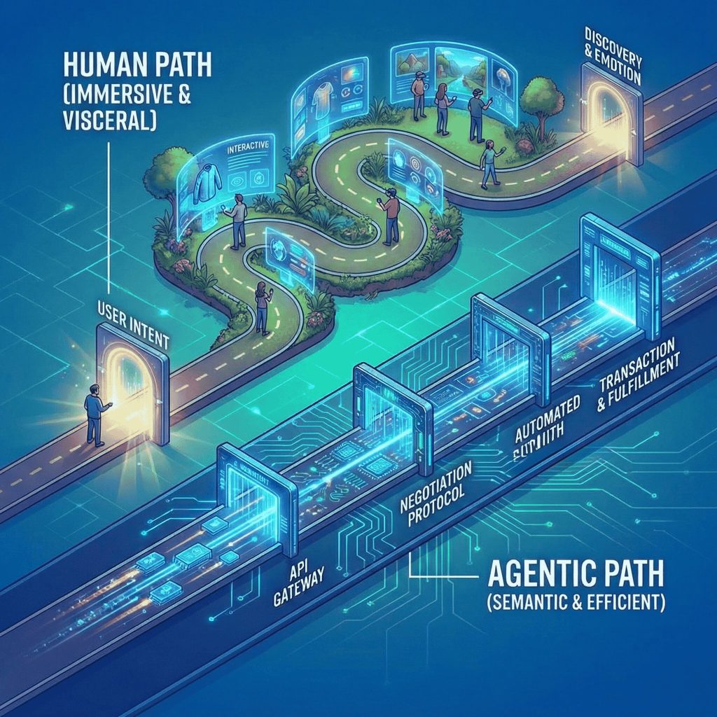
This bifurcation defines the central challenge for every CXO reading this paper. For human users, the imperative is visceral experience: immersive, spatial, emotionally resonant interfaces that justify the cognitive effort of engagement. For AI agents, the imperative is semantic legibility: invisible, API-first data structures that allow algorithms to crawl, evaluate, and transact without friction. These are not competing priorities , they are complementary layers of the same strategic challenge. Brands that master both will define the next decade of digital commerce. Those that master neither will find themselves invisible to both audiences.
Your next best customer may not be human, and your UX strategy needs to account for that.
This comprehensive white paper outlines the core UI/UX shifts defining 2026. It explores the rise of Generative UI, the absolute necessity of Trust Architecture, the shift to tactile and multimodal interactions, the critical importance of designing for cognitive fluency in vernacular ecosystems, and provides in-depth, sector-specific case studies demonstrating these principles in action.
The Economic Forces Behind the Design Shift
Before examining what the new design standards look like in practice, it’s worth understanding why they became necessary.
The collapse of generic customer acquisition cost is the most immediate driver. As AI-generated content has flooded the web, the concept of “search” has fragmented beyond recognition. Users no longer universally turn to a search engine; they consult vertical specific AI advisors, rely on Shopping Copilots embedded in messaging apps, or simply ask ChatGPT. The implication for UX is profound: landing pages optimized for keyword traffic are losing their utility. The design priority has shifted from acquisition to retention, from getting someone through the door to giving them a reason to stay, to share data willingly, and to return.
This brings us to zero-party data, the gold standard of 2026. Unlike third-party data (purchased) or first-party data (observed), zero-party data is freely and intentionally offered by the consumer in exchange for something they value: a personalized recommendation, a diagnostic result, a tailored routine. The UX that earns this data is not a pop-up or a loyalty form. It is an experience so genuinely useful that sharing feels like a reasonable trade.
The rise of the synthetic customer compounds this shift. When a meaningful portion of your transactions are initiated by AI agents operating autonomously, the traditional UI, designed for eyes and fingers, is simply not enough. Your product information, stored in images and unstructured text, is invisible to the algorithms making purchasing decisions on behalf of real people. In practical terms, this means your website now needs two front doors: one for humans, one for machines.
If AI is the New Front Door, Most Brands are Not Even on the Street
Generative UI: The Interface That Builds Itself
The era of designing rigid, static web pages with fixed navigation bars and immovable content blocks is over. In 2026, successful digital products utilize Generative User Interfaces (Gen-UI). Instead of forcing all users through the exact same visual funnel, the interface dynamically restructures itself in real-time based on the user’s immediate intent, environmental context, emotional state, and historical behaviour.
Unlike traditional personalization, which merely swapped out a first name in a greeting or updated a “Recommended for You” product widget, Gen-UI fundamentally changes the actual architecture and hierarchy of the page. For example, if an AI agent detects that a user is a high-intent, repeat buyer who values speed and frequently purchases a specific consumable, it will dynamically strip away promotional banners, educational copy, and lifestyle imagery. Instead, it presents a minimalist, highly focused one-click checkout flow front and centre. Conversely, for a first-time user exploring a complex, high-ticket category (like premium electronics or fine jewelry), the UI will autonomously assemble educational modules, detailed comparison tables, and video testimonials to build confidence before even presenting a “Buy” button.
This shift has transformed UI/UX designers from traditional “artists” into “behavioural engineers”. They no longer design single, linear screens. Instead, they design “systems of rules,” component libraries, and modular logic frameworks that AI seamlessly pieces together to match the exact cognitive and emotional needs of the user at that specific millisecond.
Generative UI: Moving From Static Catalogues to “Liquid” Interfaces
Trust Architecture: Designing for The Bharat
The center of gravity for consumer growth has decisively shifted toward India’s non-metro geographies, the “Bharat” market. Over three in five new online shoppers now emerge from Tier-3 or smaller towns. With over 650 million vernacular-first internet users driving consumption, importing Western design heuristics is a guaranteed path to failure. This demographic demands culturally fluent, voice-activated, and deeply localized user experiences that address profound regional trust deficits and unique cognitive models.
Core Elements of Trust UX
- Explainable AI: As AI increasingly takes over product recommendations and decision support, the traditional “black box” approach causes severe anxiety among new digital adopters. Trust UX requires interfaces to explicitly explain why an action is happening or why a product is being shown. (e.g., Instead of “Recommended,” the UI states: “We recommended this ₹2000 smartwatch because it connects best with the specific Android model you are currently using.”)
- Secure Interaction Patterns and Color Psychology: Visual security signals must be overt and culturally aligned. Colors are not just aesthetic choices; they are psychological triggers. Indian financial and commerce apps use distinct color psychology to soothe anxiety. For instance, Paytm’s heavy reliance on blues and whites visually communicates institutional stability, reliability, and bank-like security. Zomato uses reds and yellows to stimulate appetite and warmth, while Swiggy uses orange and black to convey energetic, premium service.
- Transparent Consent & Zero Dark Patterns: Regulatory shifts (like the EU AI Act and India’s DPDP Act) and heightened consumer awareness have made dark patterns toxic to brand equity. Tactics like fake urgency timers (e.g., a false “Only 2 items left!” countdown) are not just unethical; they are actively penalized. Trust UX makes data usage explicitly clear, ensures opt-outs are as frictionless as opt-ins, and builds long-term loyalty through total transparency.
Cognitive Fluency and the Vernacular Revolution
To capture the massive influx of non-English speaking Indians navigating the digital economy, basic machine translation APIs are grossly inadequate. Over 68% of Indian internet users now prefer content in their native language. True vernacular UX requires treating Indic scripts as first-class, aspirational design elements rather than localized afterthoughts.
The Psychology of Decision Fatigue
The scientific basis for native-language interfaces lies in “cognitive fluency,” the speed and ease with which the brain processes external information. Users process information much more fluently in their native tongue, and the human brain utilizes a powerful heuristic shortcut that subconsciously equates “easy to read” with “truthful and reliable”. By lowering the mental effort required to read a complex product description or a return policy, brands directly reduce the cognitive fatigue that leads to cart abandonment.
Typography and Hyper Local Aesthetics
The Hyper-Local Vernacular trend, definitively proving that “Desi is Cool”. For years, Indian apps suffered from cramped, broken layouts because they relied on Latin-based design grids that brutally shortened the complex matras (vowel signs) and conjunct characters of Hindi, Tamil, or Bengali. Today, leading designers utilize custom engineered vernacular typography that gives regional languages the same visual weight, breathing room, and premium feel as English streetwear brands.
Furthermore, iconography must carry deep cultural resonance to be effective. For instance, transitioning a standard, geometric “Submit” button into the shape of a glowing diya (oil lamp) during the Diwali festive season is not mere decoration. It is a profound cultural metaphor that makes the digital interface feel familiar, respectful, and native to the user’s lived reality, guiding them naturally without overloading them with text.
Multimodal and Voice-First Commerce (Zero-UI)
Because typing friction and varying literacy levels remain significant barriers for the next half-billion users, voice interfaces and multimodal interactions (combining voice, visuals, and gestures) have become the default standard for eCommerce discovery in India. Voice commerce is actively replacing text search as the primary gateway for regional language shoppers.
Designing for Code-Mixed Intents
The unique UX challenge in India is that users rarely speak pure, textbook languages. They communicate in fluid, “code-mixed” dialects like Hinglish or Tanglish. A user is highly likely to dictate a complex, multi constraint prompt such as, “Mujhe budget mein red running shoes dikhao ₹2000 ke andar”. The underlying AI architecture must feature advanced “slot-filling” schemas capable of parsing these blended languages, instantly extracting the intent, category, color, and precise price constraints to deliver accurate results.
Multimodal Feedback Loops
Voice commerce frequently fails when a user speaks into the void and is left staring at a static screen, wondering if the AI truly understood their nuanced request. The 2026 standard solves this through multimodal feedback, specifically utilizing voice-triggered personalized video answers. When a user asks a complex question, the UI instantly generates a highly compressed, dynamic 10-to-20-second visual response. This provides tangible, immediate visual proof that the request was comprehended perfectly. Furthermore, the integration of NPCI’s “Hello! UPI” protocol allows the final financial checkout to be authorized entirely via secure voice command, creating a completely frictionless, hands-free loop from initial discovery to final payment.
Because digital platforms inherently lack physical touch, the UI must simulate physical substance to convey a sense of premium quality and reliability. Buttons are now designed to look like they are crafted from tangible materials, jelly, chrome, or soft clay. When interacted with, they don’t just instantly change color; they deform, squish, and bounce back with physics-based micro-interactions.
This movement also heavily incorporates translucency, layered depth, and soft, dynamic shadows to make elements look inherently “touchable”. This material realism signals meticulous precision and high polish, which subconsciously raises the user’s perceived trust in the product’s maturity and stability. Restraint paired with kinetic precision now reads as the ultimate luxury in digital spaces.
Sector by Sector: The New Minimum Viable Experience
Fashion & Apparel: Selling Certainty, Not Products
The fashion industry’s defining UX problem has always been the gap between what something looks like on a screen and what it feels like on a body. In 2024, that gap cost the industry 30 to 40 percent of its revenue in returns. The 2026 response is not better photography, it is simulation.

Physics based virtual try-on, built on LiDAR equipped devices, now allows a user to scan themselves once and create a privacy preserved body mesh. When they view a silk dress, the interface renders that garment’s actual weight and drape against their specific proportions.
It moves when they move. More crucially, a “tension map” overlay shows where the garment might feel tight across the shoulders or hips, information that no photograph, however well-lit, can convey. Returns due to fit feel have dropped sharply for brands that have deployed this technology at scale.
The more strategically significant shift, however, is the move from selling items to selling wardrobe modules. Consider the hypothetical Uniqlo 2026 experience: the app scans your existing closet and, when you view a new beige trench coat, dynamically generates three outfits using garments you already own. The implicit message, “this $80 coat unlocks five new combinations,” reframes the purchase entirely. You are not buying a coat. You are investing in the expandability of what you already have. This is a fundamentally different emotional proposition, and it requires a fundamentally different UX to deliver it.
Indian Case Study (Myntra): Myntra’s integration of virtual try-on features resulted in a massive 30% increase in customer engagement, proving that physics-based VTO effectively solves the deep-rooted “fit and feel” uncertainty for the Indian demographic.
PracticeNext Portfolio (Kick Game): We designed an immersive, community first omnichannel experience for this premium UK sneaker destination. By blending luxury aesthetics with streetwear culture and integrating high-fidelity product imagery, the optimized eCommerce UI drove an 18.5% increase in conversions, a 16% lift in first time purchases, and a 14.5% uplift in Average Order Value.
PracticeNext Portfolio (Roger Vivier): We elevated the digital boutique for this iconic luxury maison by implementing cinematic storytelling and high-fidelity, tactile product visualization that perfectly translates their physical luxury into a premium, low-friction online checkout flow.
Food, Beverage & Lifestyle: Phygital Storytelling
PracticeNext Portfolio (Taylors Wines): To celebrate their 50th anniversary, we bridged the physical and digital divide by integrating NFC and Augmented Reality (AR) into their packaging. Users can scan the physical wine bottle to unlock an immersive AR digital experience detailing the brand’s history, verifying product authenticity to combat counterfeiting, and highlighting their commitment to science-based sustainability targets.
PracticeNext Portfolio (The Hillcart Tales): We translated their artisanal heritage into a deeply immersive digital experience. The UI utilizes rich, hand painted water color illustrations to visually communicate the origin of their rare tea blends across Darjeeling, Rwanda, and Assam, perfectly aligning the digital interface with their premium, sustainable physical packaging.
Nutraceuticals & Wellness: Making Efficacy Visible
Wellness brands face a different trust problem. The supplement market has suffered from decades of overpromised outcomes and underdelivered results, and the 2026 consumer, armed with wearable data and a healthy skepticism of influencer claims, demands proof rather than promises.
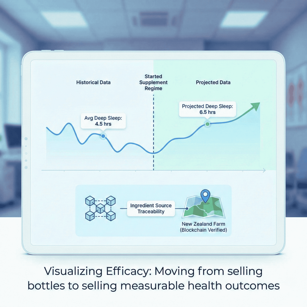
The most effective UX response has been to make efficacy visible before purchase. Brands like HealthKart now offer landing experiences that sync with Apple Health or Whoop, then render a personalized projection: based on your sleep data (averaging, say, five and a half hours per night), here is your current recovery baseline, and here is the modeled trajectory after 30 days of a specific supplement. This is not a testimonial. It is a data-driven forecast anchored in the user’s own biometrics, and it creates a standard of accountability that forces product quality to keep pace with the promise.
Equally important is what might be called ingredient traceability UX. A blockchain backed visual that allows a user to click on a bottle of whey protein and trace that specific batch back to a farm in New Zealand satisfies the “clean label” demands of today’s consumer in a way that a certification badge cannot. It transforms transparency from a brand claim into a verifiable experience.
Sports & Fitness: When the Product Page Becomes a Performance Dashboard
Sports commerce has undergone perhaps the most structural transformation of any retail category. In an industry where physical performance is the shared language of the community, “reviews” traditionally a text field filled with subjective impressions have been replaced by aggregate performance data.
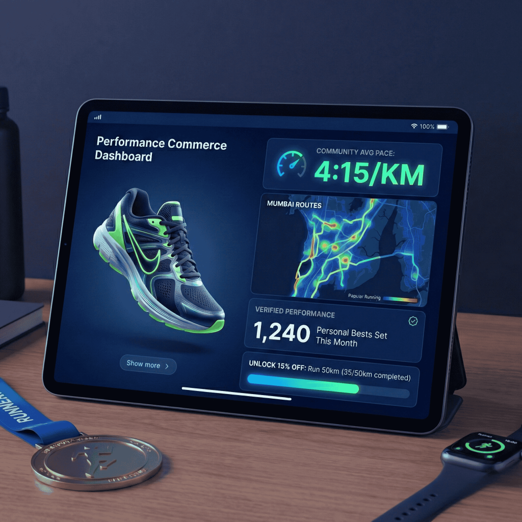
On a Nike or Decathlon product page for a marathon shoe in 2026, a customer learns not just what other buyers thought, but what they ran. Thirty-four runners in your city set a personal best in this shoe last month. The average pace for users of this model is 5:30 per kilometer. This shifts the entire credibility of the product claim from the brand’s marketing to the community’s measurable output, a far more convincing argument for a performance focused buyer.
The loyalty mechanic has evolved in parallel. Dynamic “unlock pricing” allows users to earn a 10 percent discount by verifying, via their GPS tracker, that they ran 50 kilometers last month. The discount is not a promotional giveaway, it is an achievement. This reframes the brand relationship as a partnership between serious athletes and a brand that takes their commitment seriously, creating stickiness that no generic loyalty program can replicate.
Indian Case Study (Cult.fit): Cult.fit successfully leveraged its massive offline community and deep app engagement data to launch its own line of activewear. The platform uses gamification and community milestones to promote highly functional performance wear directly to their digitally native user base.
PracticeNext Portfolio (Vessi): For this waterproof footwear innovator, we focused on a conversion optimized, mobile-first digital storefront. The UI clearly visualizes their unique product tech, supporting a massive 49.44% lift in attributed revenue and a 46.61% increase in transactions by accurately tracking upper-funnel user journeys.
Cosmetics: Transparency as Aesthetic
The cosmetics category has been destabilized by “dupe culture,” the widespread consumer behavior of reverse engineering premium products and purchasing near identical alternatives at a fraction of the price. The most effective antidote is not brand prestige or aspirational marketing. It is radical transparency delivered through a lab-like UX.
The “texture-first” interface is one expression of this. Because a standard product image cannot convey the feel of a foundation, its viscosity, absorption speed, or skin finish, leading brands now deploy haptic video: ultra high frame rate macro footage of the product being applied, scrubbable by the user, that triggers a genuine sensory impression through visual fidelity alone. Paired with an AR lighting lab that renders a user’s made-up face under office fluorescent light, candlelight, and natural daylight in real time, this approach closes the imagination gap between browsing and ownership.
The implicit message embedded in this transparency is that the brand has nothing to hide, and in a market saturated with hidden fillers and misleading claims, that message lands powerfully.
Global Case Study (Sephora & Estée Lauder): These beauty giants launched highly advanced in-store and app-based AR “smart mirrors.” The ability to do rapid, touchless makeup try-ons under varied lighting resulted in an estimated 31% increase in sales for Sephora and a 2.5x higher conversion rate for Estée Lauder lipsticks.
Indian Case Study (Insight Cosmetics): Insight capitalized on the “performance-led beauty” trend by engineering products specifically for the Indian climate (humidity, pollution). Their digital strategy focuses on formulation transparency and safety, building immense trust and scaling rapidly among value-conscious buyers in Tier-2 and Tier-3 markets.
Skincare: The Diagnostic as the Experience
Skincare’s UX challenge is choice paralysis. The average consumer faces hundreds of ingredient interactions, contraindications, and routine sequences, knowledge that was previously the domain of dermatologists. The 2026 response has been to embed the consultation directly into the commerce experience.
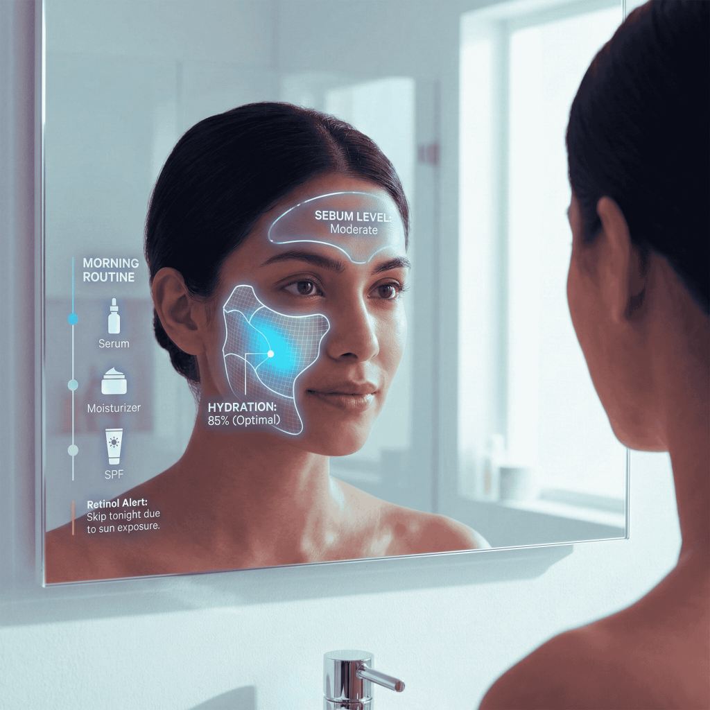
Brands like Minimalist no longer allow customers to simply browse and buy. They onboard them through a diagnostic: an AI agent analyzes a selfie to identify dehydration lines, pore distribution, and pigmentation patterns, then assembles a personalized routine rather than a product list. More importantly, the cart itself is visualized as a morning and evening timeline, and it actively warns of conflicts, alerting a customer, for instance, that retinol and vitamin C serum should not be used together. This “safety UX” does something marketing cannot: it demonstrates that the brand’s interest in the customer’s skin health supersedes its interest in selling more product. Trust built this way is extraordinarily durable.
Global Case Study (Clinique): Clinique introduced the “Clinical Reality” app, which utilizes advanced computer vision to scan a user’s face. The AI highlights specific problem zones, like fine lines or texture, and instantly outputs a highly personalized regimen.
Indian Case Study (SkinKraft): SkinKraft engineered an AI-driven skin profiling system specifically calibrated for Indian skin tones. The platform accounts for local environmental challenges, like pollution triggered acne and humidity induced oiliness, to generate bespoke formulations rather than pushing generic, Western-centric products.
Consumer Electronics: The “Vibe” UI
The Trend: Moving away from dry, text-heavy technical specification sheets to high energy, video first lifestyle storytelling that caters to shorter attention spans.
Success Story: Brands like boAt and Noise dominate the youth market by employing immersive, visually dense interfaces that treat audio hardware and smartwatches as aspirational fashion accessories rather than just functional tech utilities.
Quick Commerce: Conversational Discovery
The Trend: Integrating large language models directly into the search bar, allowing users to discover complex baskets of products through natural conversation rather than rigid, multi-step filtering menus.
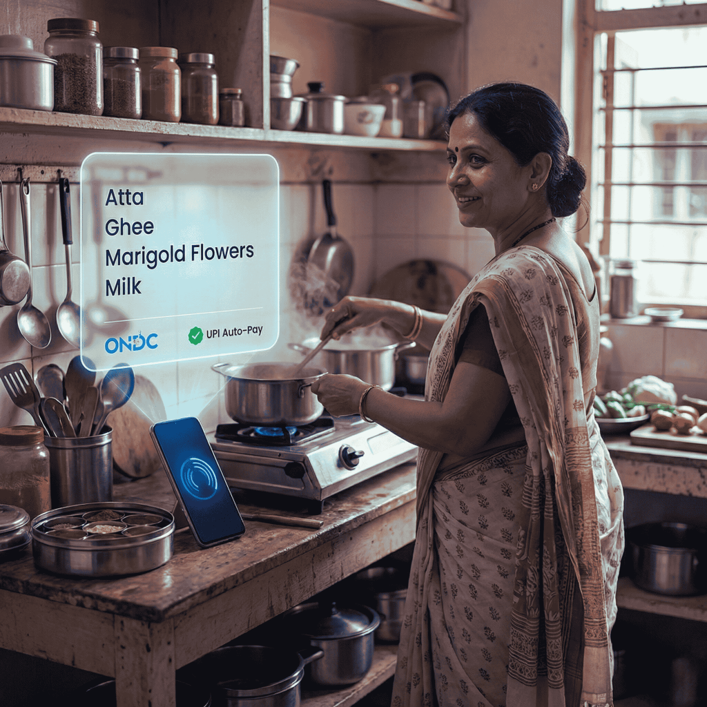
Success Story (ONDC Integration): The Open Network for Digital Commerce (ONDC) acts as the ultimate interoperable backend for hyperlocal apps. Instead of searching for “rice,” “ghee,” and “flowers” separately on a quick commerce app, a user can simply dictate in Hindi: “Kal pooja hai, uske liye samagri chahiye” (There is a prayer ceremony tomorrow, I need the ingredients). The AI instantly understands the profound cultural context, queries local ONDC-registered sellers, and autonomously populates the cart with all necessary items.
B2B Commerce: The Consumerization of Wholesale
The Trend: The multi-trillion-dollar B2B market has finally shed its clunky, legacy interfaces. Enterprise buyers now demand the aesthetic elegance and frictionless flow of a B2C app, seamlessly combined with the heavy backend functionality required for complex credit limits, real-time ERP integration, and multi-warehouse syncing.
Success Story: Udaan transformed the highly fragmented Indian B2B distribution network by focusing entirely on predictive intent. Rather than just acting as a digitized catalogue, Udaan’s interface observes vast amounts of customer behaviour to anticipate seasonal restocking needs. In 2024, they processed over 2.25 billion products, achieving a remarkable threefold rise in repeat business by mastering the “science of anticipation”.
Success Story: Tata Mavic completely overhauled their legacy Sales Force Automation tool, by conducting deep ethnographic field research to understand the real world friction faced by sales reps in rural India, they redesigned the UI to be exceptionally human-centric. This resulted in a massive 85% user adoption rate within six months, a 40% reduction in order booking time, and a 22% increase in monthly sales growth directly attributed to the streamlined interface.
PracticeNext Portfolio (Saint-Gobain India): We spearheaded a massive digital transformation for the multinational manufacturing giant’s Indian digital presence. We redesigned the Saint-Gobain India site to act as a sophisticated, unified B2B ecosystem. The highly intuitive UI simplifies complex product discovery for architects, contractors, and on-site building professionals, offering localized content. Furthermore, we deployed comprehensive cross-domain analytics to unify their digital marketing measurement across regional divisions.
PracticeNext Portfolio (FusionCX): We modernized the digital presence for this global customer experience leader, designing a seamless interface that visually articulates the powerful synergy between their cutting-edge AI-driven support tools and their human-in-the-loop workflows, proving that enterprise software can be both incredibly powerful and beautifully intuitive.
Green UX: Sustainable Digital Design
In 2026, environmental sustainability is no longer relegated to a corporate social responsibility footer; it is a highly measurable, heavily scrutinized UI performance metric. The unchecked growth of high-fidelity media assets and heavy AI models consumes massive amounts of server energy. “Green UX” principles are now standard practice to lower the carbon footprint of digital ecosystems, which conveniently aligns perfectly with business goals of faster load times and better conversion rates.

Dark Mode by Default: Modern interfaces are frequently optimized for OLED screens. By keeping large portions of the screen black, the pixels remain completely unpowered. This significantly conserves device battery life and drastically reduces the overall energy drawn from the grid by millions of simultaneous users.
Data Efficiency & Lazy Loading 3.0: Designers are aggressively auditing their digital footprint. They utilize variable fonts instead of calling multiple font weight files, heavily compress high-fidelity visual assets, and use predictive AI to calculate exactly where a user intends to scroll. The system then only loads the specific media assets required for that viewport. This prevents the massive, wasteful transfer of data that the user will never see, ensuring the UI remains blazing fast and energy efficient, even on patchy Tier-3 mobile networks.
Architecture: Building for Both Audiences
Delivering these experiences requires the underlying technical architecture to evolve. The monolithic commerce platform, designed to serve a single human facing frontend, is no longer sufficient.
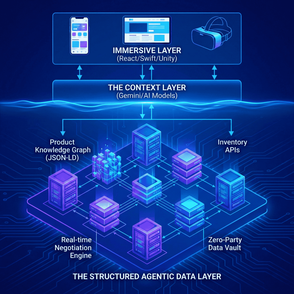
The most important architectural shift is the construction of a genuine agent ready data layer. This means exposing product knowledge not as flat attributes in a database, size: M, color: blue, but as structured semantic relationships. A running shoe should be stored as an entity with relational properties: optimized for high arch feet, performs best in wet conditions, recommended for distances above 42 kilometers. When a user asks an AI, “what’s the best shoe for flat feet in the rain,” the AI can retrieve this product because the logic is exposed, not merely the keywords. Practically, this means implementing JSON-LD and Product Knowledge Graphs alongside the standard HTML frontend. Two front doors, as noted, one for humans, one for machines.
The design workflow itself has also shifted. The linear sequence of wireframe, mockup, and handoff to engineering has given way to something faster and more iterative. In 2026, designers work with tools like Google AI Studio to inject brand guidelines, fonts, hex codes, tone of voice, directly into a generative context, then prompt for prototype code. A single prompt, “design a mobile checkout flow for a luxury watch brand, high-net-worth user, minimize clicks, use our Ice Blue brand color,” returns React and Tailwind code for a biometric single-page checkout that skips address forms entirely. Synthetic testing follows: AI agents roleplay frustrated customers with slow internet connections trying to make a return, surfacing friction points before any real user encounters them.
The Senior Designer’s Guide to Google AI Studio
Organizational Structure: The Experience Pod
The siloed organizational structure that separated UX designers from developers, and both from data teams, was designed for a different era of digital products. In 2026, it cannot produce the integrated experiences that consumers and agents now expect.
The emerging replacement is the Experience Pod: a small, cross functional team organized around a product surface rather than a functional discipline. A complete pod contains four roles that did not coexist five years ago. The Spatial Designer brings skills in 3D, AR, and immersive environments, Unity and Unreal Engine are now design tools, not just development tools. The Agent Architect is a technical role focused on ensuring the brand’s data is structured and exposed for AI consumption, with deep expertise in Schema.org. The Prompt Engineer fine-tunes the brand’s internal AI models so that the shopping copilot speaks in the brand’s voice, not in generic AI cadences. And the Ethics and Compliance Lead ensures that persuasive design does not cross into dark patterns, a distinction now enforced by both the DPDP Act in India and the EU AI Act.
This last role deserves particular emphasis. The capability to personalize is also the capability to manipulate, and regulators in 2026 are no longer giving brands the benefit of the doubt on that distinction. Embedding compliance expertise directly in the design team — rather than routing it through legal review after the fact — is both an ethical and a commercial imperative.
Conclusion: The Return to Service
There is something almost paradoxical about the direction all of this technology is pointing. The agentic AI that autonomously restocks your pantry, the spatial interface that lets you try on a dress from your living room, the diagnostic that tells you which skincare ingredients to avoid, these are expressions of extraordinarily sophisticated technology. And yet their purpose is something ancient: to know the customer, to anticipate their needs, and to serve them well.

The Web 2.0 era, roughly 2010 to 2024, disrupted that relationship. It replaced the shopkeeper who knew your name and your history with an efficient, impersonal catalog. The AI era is restoring it, not through nostalgia, but through scale. The agentic AI is the shopkeeper with perfect memory. The spatial interface is the fitting room that never closes. AEO is the reputation that brings a customer through the door before they even know they need you.
For the CXO, the directive is clear: stop building stores and start building relationships. The brands that define the next decade will not be the ones with the most sophisticated technology. They will be the ones that used that technology not to increase distance from the customer, but to become, invisibly, helpfully, and consistently — present in their lives.
Immediate Priorities for CXOs
The strategic picture described in this paper points to three concrete actions that should be underway now.
In the first quarter, conduct a crawlability audit. Can a generic AI agent successfully navigate your site, evaluate a product, and complete a purchase without human intervention? Most brand sites cannot pass this test today, and the gap is costing them revenue from machine-initiated commerce. Fixing the DOM and implementing structured data is not a long term roadmap item, it is a near term commercial fix.
In the second quarter, launch one agentic feature at meaningful scale. A gift finder bot that builds a real cart. A routine builder that warns of product conflicts. A post delivery activation flow that makes the product useful before the unboxing experience fades. One well executed agentic feature teaches the organization more about this paradigm than any amount of theoretical planning.
In the third quarter, begin spatial asset conversion. Hire a Spatial Experience Designer and start producing GLTF and USDZ versions of your top 100 SKUs. The customers and agents of 2027 will expect 3D product representations as a baseline. Building that library now, while it still differentiates, is preferable to scrambling to build it later, when it is merely table stakes.
Sources & Further Reading
- Forrester Research: The State of Agentic Commerce 2026
- McKinsey & Company: The Next Horizon of Digital Retail
- Google Search Central: Structured Data for Merchant Listings
- Salesforce: State of the Connected Customer
- Nielsen Norman Group: Heuristics for Artificial Intelligence Design
This white paper was prepared as a strategic blueprint for Digital Transformation leaders. February 2026.
We create scalable, mobile-first experiences that seamlessly blend your brand’s narrative, visual identity, and user experience across every channel. By forging deep emotional bonds, our designs transform your casual visitors into devoted brand advocates.


Pingback: AI-Native Digital Growth System: Unified OS for Enterprise I PracticeNext