
Why “Web Design” Isn’t Enough Anymore
For the last decade, “web design” has been reduced to something painfully narrow: picking a premium theme, tweaking some colors, maybe commissioning custom photography if you’re feeling ambitious. Brands obsess over whether their buttons should have rounded corners while the fundamental architecture of online shopping remains frozen in 2020, a homepage hero, a grid of products, and a checkout form.
The next generation of digital storefronts won’t just be “pretty.” They’ll be atomic in structure, generative in nature, psychological in speed, and spatial in context. Those aren’t buzzwords; they’re the four architectural shifts that separate brands building passive catalogs from those building intelligent, adaptive systems.
This isn’t about aesthetic trends or the latest design fad. It’s about the strategic UI/UX evolution required to stay relevant when everything about how people shop online is changing. Let’s break down what that actually means.
The Structure Problem
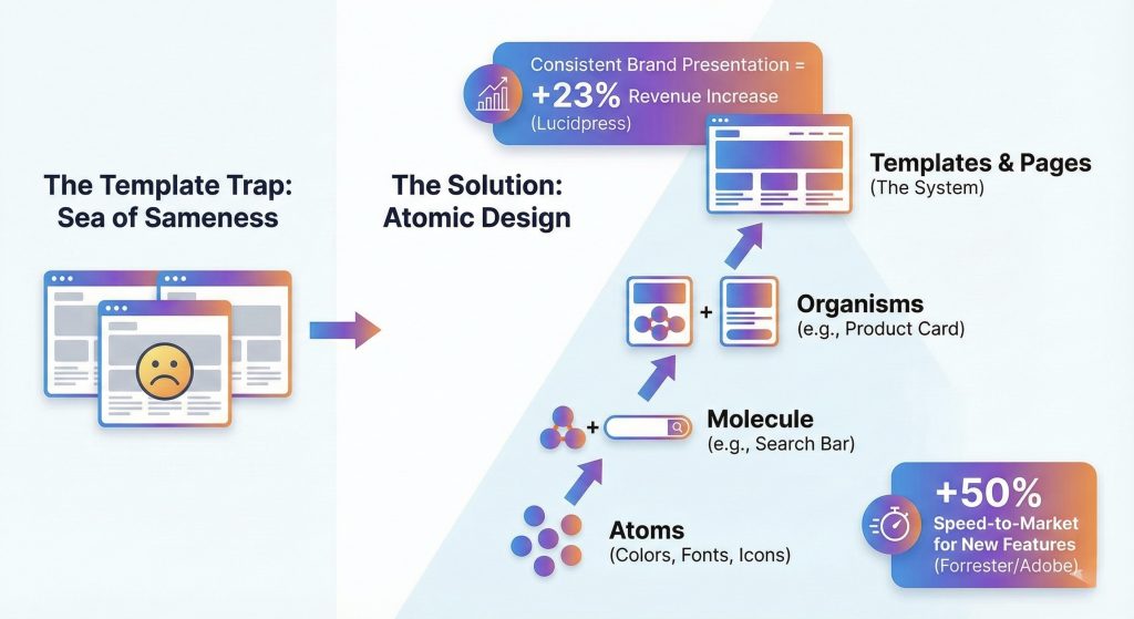
You’re Trapped in the Sea of Sameness
You’ve migrated to Shopify Plus. You’ve optimized your backend infrastructure. Your operations are running smoothly. But when you look at your actual storefront with fresh eyes, there’s this nagging feeling of familiarity. The oversized hero banner with the lifestyle photo. The three column product grid. The newsletter popup that appears exactly 5 seconds after landing. It looks clean and professional. It also looks exactly like everyone else in your category.
This is what happens when thousands of brands rely on templates to digitize quickly. Templates are efficient, but efficiency comes at a cost, they homogenize the internet. When every brand in your space uses the same UI patterns and navigation structures, price becomes your only differentiator. That’s a race to the bottom nobody wins except customers who comparison shop across twenty identical tabs.
The good news? You don’t need to blow up your entire site and start over. You need something more fundamental: a design system built on atomic principles.
Building Systems, Not Pages
The atomic design, which sounds complicated but is actually elegantly simple. Instead of building a site page by page, you build it component by component.
Start with atoms, the basic building blocks like colors, typography, icons, and spacing rules. Combine atoms into molecules, which are functional units like a search bar made from an input field plus a button. Molecules combine into organisms, which are distinct interface sections like a product card that includes an image, price, title, rating, and add-to-cart button. Organisms assemble into templates, which become your final page layouts.
The fundamental shift here is moving from managing “websites” to managing a design system. When marketing wants to launch a flash sale page, developers don’t start from scratch. They pull pre-approved organisms from your component library and assemble the page like LEGO blocks. What used to take three weeks now takes three hours. More importantly, it’s automatically consistent with everything else you’ve built because it’s using the same atomic components.
This isn’t just about speed. It’s about maintaining coherence as you scale across dozens or hundreds of pages, multiple campaigns, and expanding product lines. Your design system becomes the single source of truth that prevents drift.
The Intelligence Shift
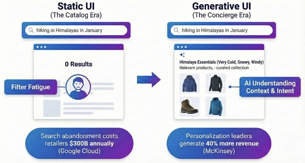
Why Static Catalogs Are Dying
For twenty years, the ecommerce user journey has been essentially static. Homepage to category page to filter panel to product detail page. It works, sort of, but it puts all the cognitive burden on the user. They have to know what they’re looking for, translate that into the right keywords or filter combinations, and manually browse through results hoping something matches their actual need.
In the age of AI, this static model isn’t just outdated—it’s a competitive liability. We’re moving rapidly toward generative UI, where interfaces assemble themselves in real-time and adapt their layout and merchandising to match user intent instead of forcing users to adapt to your navigation structure.
The $300 Billion Discovery Gap
Search abandonment costs retailers $300 billion annually, and the reason is simple: keyword search is brittle. When someone searches for “summer wedding guest dress,” they often get zero results because no product in your catalog is literally named that exact phrase. They know what they need. You have what they need. But the interface can’t bridge that gap.
The filter experience is even worse. Users click through checkbox after checkbox trying to narrow results, often ending up with either zero matches or still too many options to reasonably evaluate. This is what we call filter fatigue, and it’s killing discovery for anything beyond the most straightforward searches.
From Search to Consultation
The fix is moving from search to consultation; treating every product discovery interaction more like a conversation with a knowledgeable salesperson than a database query.
Using vector search and large language models, the interface can understand context rather than just matching keywords. When a user asks “I’m going hiking in Patagonia in November,” the system comprehends the underlying requirements: cold, windy, potentially rainy conditions at high altitude. It dynamically assembles a collection prioritizing windbreakers, waterproof boots, and layering pieces, even though the user didn’t type any of those specific product categories.
This is semantic understanding applied to commerce. The AI doesn’t just match words, it infers needs and maps them to product attributes.
The Liquid Interface
But generative UI goes beyond search. The entire layout can adapt based on who’s using it. The same product URL shows dramatically different content depending on the user’s context and needs.
A B2B buyer viewing a technical product sees detailed specification tables, bulk pricing calculators, and procurement workflow options prominently displayed. A DIY hobbyist looking at the exact same product sees how-to videos, user reviews from other hobbyists, and project inspiration galleries. The product data is the same. The interface is liquid, reforming itself around the user.
This is the shift from catalog thinking to concierge thinking. Your interface stops saying “here’s what we sell” and starts saying “here’s what you need.” That’s not just better user experience—it’s fundamentally different commerce architecture.
The Psychology of Speed
When Fast Isn’t Fast Enough
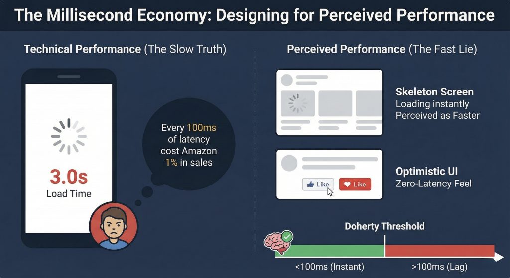
You’ve built your design system. You’ve implemented AI personalization. Your backend is optimized. But if a user clicks “Add to Cart” and watches a loading spinner for three seconds, none of that infrastructure matters. They’re already wondering if your site is broken or if they should try a competitor instead.
In digital commerce, speed is the currency of trust. But here’s the nuance most teams miss: there’s a significant difference between a site that’s technically fast according to Lighthouse scores and a site that feels fast to actual humans using it. This is the domain of perceived performance, the psychology of speed rather than just the metrics of speed.
The 100-Millisecond Threshold
The Doherty Threshold, established through cognitive research, found that the human brain perceives an action as “instant” if the response happens in under 100 milliseconds. Once you cross that threshold, even by just a few hundred milliseconds, the user’s mind begins to disconnect. They shift from feeling in control of the interface to feeling like they’re waiting on the interface. That psychological shift is where friction enters the experience.
You can’t always make things actually happen in under 100 milliseconds, server requests take time, database queries have latency, payment processors have their own response times. But you can use psychological principles to make things feel faster than they are. This isn’t deception. It’s respecting how human perception actually works.
Cheating Time with Smart Design
The loading spinner is your enemy because it highlights the wait. It tells users “stop what you’re doing and watch this wheel rotate until we’re ready.” Skeleton screens flip this psychology. They show gray, pulsing outlines of the content that’s loading, giving users a preview of what’s coming. Studies consistently show users perceive skeleton screens as faster than spinners, even when the actual loading time is identical. The brain is processing a preview instead of watching a progress indicator, which fundamentally changes the experience.
Optimistic UI takes this further by lying in the most helpful way possible. Traditional interfaces wait for the server to confirm an action before updating the interface. When you click “Like” or “Add to Cart,” there’s a pause while the request travels to the server, gets processed, and sends back confirmation. Optimistic UI assumes the action will succeed, which it does 99.9% of the time, and updates the interface immediately. The button turns red instantly, and the server request happens in the background. If it fails, you roll back gracefully. But in the vast majority of cases, you’ve just created a zero-latency feel.
When you truly can’t eliminate waiting, processing a payment takes real time, use functional animation. Instead of showing a static “Processing…” message, animate progress. Turn waiting time into watching time. The user’s brain stays engaged with motion and progress indicators rather than wondering if something broke.
Beyond the Flat Screen
The Immersive Computing Transition
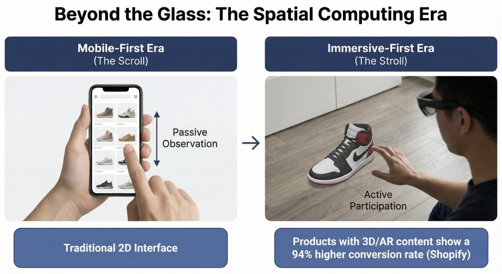
For fifteen years, “responsive design” meant adapting desktop layouts to smaller mobile screens. The content changed sizes and rearranged itself, but it remained fundamentally trapped behind a flat sheet of glass. You scroll through pages. You tap on buttons. The metaphor is still paper, just backlit and interactive.
With the rise of spatial computing, Apple Vision Pro, Meta Quest 3, and whatever comes next—the screen is dissolving. We’re transitioning from the mobile-first era to what we’re calling the immersive-first era, and the design implications are profound.
From Scroll to Stroll
Mobile AR today gives us glimpses of what’s coming. A user points their phone at their living room floor and sees a virtual sneaker appear in actual size, lit by their real lighting. The interface isn’t a grid of product photos, it’s a three dimensional object they can walk around and examine from any angle.
Spatial computing takes this to its logical conclusion. Users won’t look at product pages anymore. They’ll stand next to life-size virtual models of products in their own space. They’ll reach out and interact with controls floating in their environment. The product discovery experience becomes navigating a virtual showroom rather than scrolling through a catalog.
The New Rules for Spatial Design
Designing for spatial contexts requires unlearning almost everything we know about 2D interface design. The constraints are completely different.
Spatial interfaces use translucent backgrounds because they exist in the user’s real environment. Your text needs to remain legible whether the user is standing in a bright kitchen or a dim bedroom. The traditional solid white background doesn’t exist anymore, everything floats with depth and context.
Eye tracking replaces the mouse. Users look at buttons to activate them, which means you need generous hover states that provide feedback before selection happens. Hit zones need to be larger than you’d use for a cursor because eye tracking has more jitter than precise mouse movements. The tolerance for tiny tap targets drops to zero.
Object permanence becomes critical in ways that don’t matter in 2D interfaces. If a user drags a virtual shopping cart to their coffee table, it needs to stay there even if they walk away and come back an hour later. Spatial memory is powerful—violating it by having objects disappear or move unexpectedly is deeply disorienting.
The Practical Takeaway
The screen is no longer a boundary. It’s a window, and increasingly, it’s not there at all.
The brands that win the next decade won’t just have fast mobile sites or clean template implementations. They’ll be the ones that understand these four architectural shifts and build accordingly. They’ll create design systems that maintain coherence across expansion. They’ll implement interfaces that generate themselves around user needs rather than forcing users to navigate static structures. They’ll master the psychology of perceived performance so interactions feel instant even when they’re not. And they’ll prepare for spatial computing while it’s still emerging rather than scrambling to catch up after it’s standard.
This isn’t about being on the cutting edge for its own sake. It’s about recognizing that the fundamental assumptions underlying ecommerce interface design, assumptions that have held for twenty years are changing all at once. The infrastructure, the intelligence, the psychology, and the form factor are all in transition simultaneously.
The question isn’t whether these shifts are coming. They’re already here in early forms, accelerating rapidly. The question is whether you’re building with these principles now or planning to retrofit them later when your competitors have already moved.
Build systems, not pages. Build intelligence, not catalogs. Build for perception, not just performance metrics. Build for immersion, not just screens.
That’s what separates a digital storefront from a digital flagship.


Pingback: eCommerce Design Trends to Watch in 2026 I PracticeNext
Pingback: The New UX Toolkit: Data, Context, and Evals - PracticeNext