Online shopping has become the norm, and the design stakes have never been higher. The stores that win aren’t just pretty, they solve problems. They clear the path between browsing and buying.
Here’s what’s changing and how it shows up in real stores.
AR and VR Have Grown Up
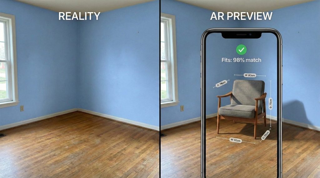
After years of hype, augmented and virtual reality tech has matured into something genuinely useful. The focus has shifted from spectacle to practicality: helping shoppers avoid bad purchases and reducing returns.
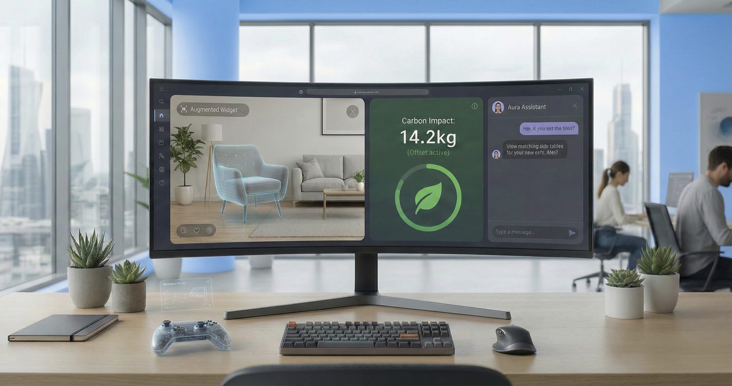
Furniture retailers now let you point your phone at an empty corner and drop in a specific armchair. You’ll see whether it fits, sure, but also how the velvet looks in your actual living room light. IKEA’s Kreativ tool does exactly this.
Skincare brands scan your face to show how a foundation covers redness in real time—not just a flat color overlay, but an accurate preview that accounts for your skin’s texture and tone.
Personalization That Reads the Room
AI is everywhere, but the best implementations stay quiet. When personalization works, it feels natural. When it fails, it feels invasive.
Spend ten minutes looking at running shoes one day, and the homepage opens the next day with performance gear, those shoes, plus matching socks and hydration packs. No winter coats in sight. Type “jacket” into search, and the site shows you leather jackets first if that’s what you’ve bought before. It anticipates without asking.
Motion With Purpose
Clean layouts are expected now. What separates good from great is how sites use small animations, micro-interactions, to provide instant feedback.
A “Buy Now” button morphs into a loading spinner, then a checkmark. You know immediately that your click registered.
Hover over a product photo and watch a two-second loop of the model walking. You see how the fabric moves, how it drapes. It’s more useful than a static zoom.
Voice for the Mundane
Voice shopping hasn’t replaced screens, but it has carved out a role in routine purchases and quick additions. Standing at the stove, you tell your smart speaker, “Add olive oil to my cart.” The grocery app knows which brand you bought last time. No follow-up questions, no guessing.
Carbon Costs at Checkout
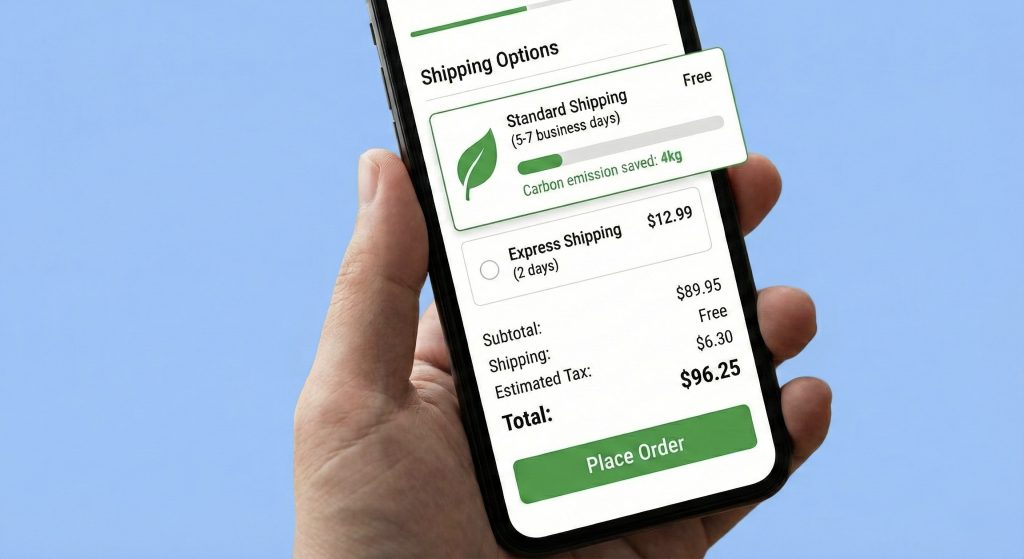
Sustainability information is moving from marketing pages to the point of purchase. For many shoppers, environmental impact matters as much as price or color.
Fashion retailers now show a “Carbon Cost” next to the dollar amount. Choose slower shipping and watch a graph drop by 30%, showing the exact emissions you just saved on this order.
Security Up Front
Privacy anxiety runs high. Smart stores bring security features forward instead of burying them.
At checkout, the “Verified Secure” lock sits inside the payment button or right next to the credit card field—not hidden in the footer. Apple Pay and PayPal logos appear where you’re actually making decisions.
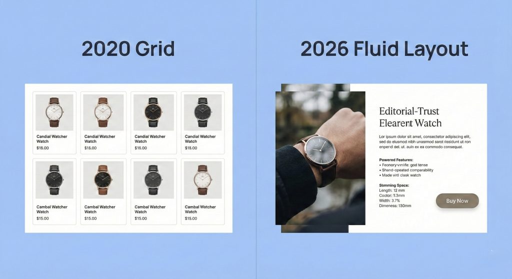
Layouts That Break Free
The grid is dead. Asymmetric layouts, split screens, and overlapping elements let brands tell stories instead of just displaying inventory.
A luxury watch site splits the screen: product specs and the buy button stay fixed on the left while you scroll through lifestyle photos and technical diagrams on the right. The images overlap artistically but never obscure the information you need.
Chatbots That Actually Help
AI chat has evolved past the frustrated customer service barrier. The good ones act like knowledgeable salespeople who remember what you said three messages ago.
Shopping for a gift? The bot asks who it’s for. You say “a 7-year-old who likes space,” and it generates a curated set of astronomy kits and sci-fi LEGOs. No category page dumping, no dead ends.
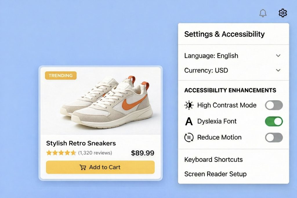
Accessibility Baked In
High-contrast modes, screen reader optimization, keyboard navigation, these aren’t extras anymore. They’re baseline requirements. Site settings include toggles for “High Contrast” or “Dyslexia Friendly” fonts. Any user can switch instantly without browser plugins or workarounds.
Real Localization
Translation isn’t enough. True localization adapts currency, payment methods, cultural imagery, and shipping expectations to each region.
A U.S. brand selling in Japan automatically prioritizes local payment apps like PayPay and adjusts address fields to match Japanese postal format. Users don’t have to translate their own address into American structure.
What It Means
eCommerce design in 2026 removes friction. The aesthetics matter less than the experience they enable.
Winners build fast, trustworthy, relevant stores. Losers use technology for show.
Redesigning your store? Ask one question: Does this feature make buying easier, or does it just photograph well?
You may also like
We create scalable, mobile-first experiences that seamlessly blend your brand’s narrative, visual identity, and user experience across every channel. By forging deep emotional bonds, our designs transform your casual visitors into devoted brand advocates.