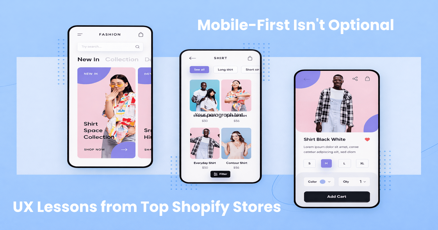
If you’re running a Shopify store and still treating mobile as a “responsive version of desktop,” you’re already behind. Not slightly behind, catastrophically behind.
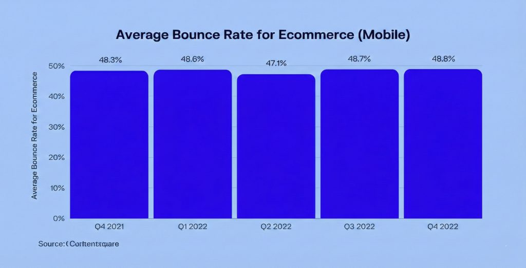
Here’s the reality most Shopify brands are facing: somewhere between 70 and 85% of their traffic comes from mobile devices. For the majority of first time visitors, their entire brand experience happens on a phone. They’re making conversion decisions in seconds, often while doing three other things simultaneously. And yet, despite these numbers, many stores still design on desktop and adjust for mobile as an afterthought.
That approach doesn’t just underperform anymore. It fails completely.
Mobile-first isn’t a design trend you can ignore until next quarter. It’s a business requirement. Top Shopify stores understand this, and they build mobile experiences around behavior, not layouts. This article breaks down why mobile UX fails on most stores, what high performing brands do differently, and the practical lessons you can apply immediately to stop leaving money on the table.
The Critical Distinction Most People Miss
Let’s start by clearing up a common misconception that costs stores thousands in lost revenue. Responsive design and mobile-first UX are not the same thing. Responsive design means you’ve built desktop layouts that resize for smaller screens. Mobile-first UX means you’ve designed experiences around mobile behavior from the start.
Most Shopify themes are responsive. Very few are truly mobile-first, and the difference matters enormously.
Mobile-first thinking starts with fundamentally different assumptions about your users. They’re distracted. Their sessions are shorter. Their attention spans are limited. And critically, thumbs, not cursors, drive their navigation. Top Shopify stores don’t just fit on mobile. They feel natural to use on mobile, which is an entirely different achievement.
Why Most Shopify Stores Fail on Mobile
Before we look at what works, let’s understand what breaks conversions. The usual culprits include tiny CTAs that are hard to tap, long unstructured product pages that go nowhere, popups covering key content at critical moments, slow load times from heavy scripts, and desktop style navigation menus that make no sense on a phone.
These issues don’t just reduce conversion rates. They increase cognitive load, which is the mental effort required to continue. On mobile, any friction feels expensive. Users have less patience, less screen real estate, and more distractions competing for their attention. When something feels hard, they leave. It’s that simple.
Lesson 1: The First Screen Decides Everything
On desktop, users might scroll around, explore your navigation, and scan different sections. On mobile, they decide fast. Really fast. Top Shopify stores optimize the first screen ruthlessly because they understand that mobile users are making judgment calls in the blink of an eye.
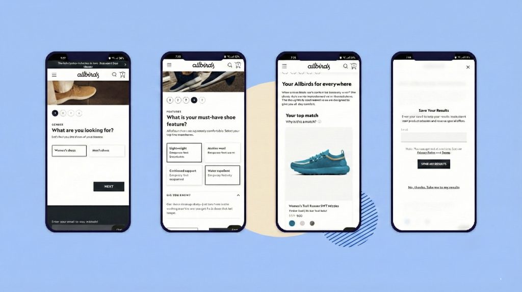
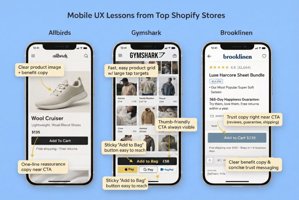
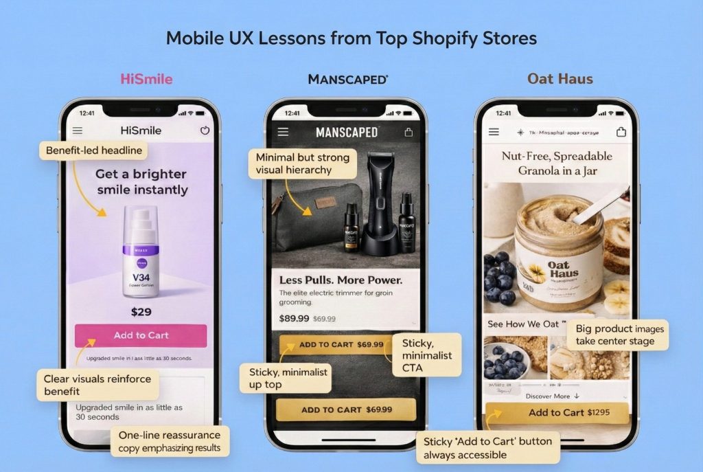
High performing stores nail this by providing clear product or category context immediately, establishing strong visual hierarchy, and focusing on one primary action per screen. Take Allbirds as an example. Their mobile experience is a masterclass in restraint. You see large product imagery, a clear value proposition, and simple “Shop” or “Add to Cart” actions. There’s no clutter and no confusion.
The lesson here is straightforward but often ignored: if users can’t understand what you sell within three to five seconds on mobile, they leave. And they don’t come back.
Lesson 2: Design for Thumbs, Not Screens
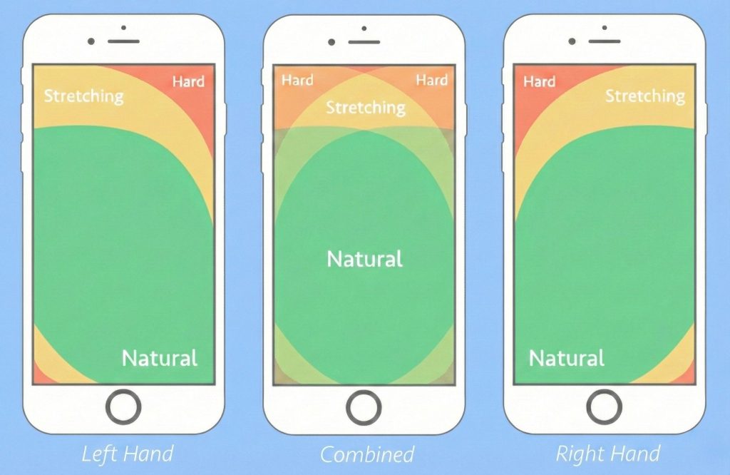
Mobile UX is physical in ways that desktop never is. It’s about reach and comfort and the mechanics of holding a device. Top Shopify stores design for one handed usage, natural thumb zones, and minimal precision tapping. This isn’t about aesthetics, it’s about ergonomics.
In practice, this means large, well-spaced buttons. It means placing CTAs near the bottom of the screen where thumbs naturally rest. It means using sticky “Add to Cart” or “Buy Now” buttons so users don’t have to scroll back up. And it means avoiding tiny text links for critical actions, because trying to tap a small target while holding a phone is frustrating.
Gymshark does this particularly well. Their mobile product pages often use sticky CTAs, making it effortless to take action without scrolling back to the top. The lesson is simple: if an action matters, make it reachable without effort.
Lesson 3: Mobile Product Pages Should Guide, Not Overwhelm
Many Shopify stores make a fatal mistake: they simply stack their desktop content vertically on mobile. The result is endless scrolling through content that was never meant to be consumed that way. Mobile product pages should guide decisions, not overwhelm users with information they didn’t ask for.
Common issues include endless scrolling through feature heavy copy blocks, product specs appearing before benefits, and hidden FAQs and policies that users have to hunt for. What top stores do instead is fundamentally different. They lead with benefits, then details. They use visual storytelling through lifestyle images and short videos. They structure information with collapsible accordion style sections. And they place clear reassurance points near CTAs, not buried at the bottom of the page.
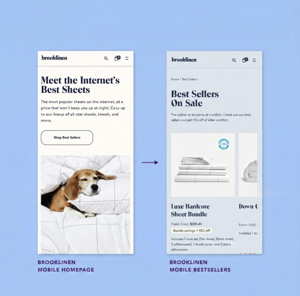
Brooklinen balances this beautifully. Their mobile product pages feature strong visuals, clear benefits, and reviews and trust signals placed strategically rather than buried where no one will find them. The lesson: mobile users don’t want more information. They want the right information, in the right order. Give them what they need to decide, not everything you could possibly say.
Lesson 4: Trust Can’t Hide in the Footer
On mobile, skepticism runs higher, especially for new brands. Users are buying something they can’t touch, from a company they just discovered, using a device that makes research harder. Top Shopify stores surface trust signals early, placing reviews close to product titles, making shipping and return information immediately clear, and integrating social proof without overwhelming the page.
What fails consistently is hiding trust information in footers that users have to scroll forever to reach, creating long policy pages that no one reads, and displaying badges without context that leave users wondering what they actually mean.
High-converting D2C brands in skincare and wellness often place star ratings right near the product name, include short reassurance copy like “Free returns • Ships in 24 hours,” and feature user, generated content images that feel authentic rather than staged. The lesson: trust should support the decision, not require investigation. Make it visible where users need it, when they need it.
Lesson 5: Checkout Should Feel Like Confirmation, Not Homework
Mobile checkout is where most Shopify stores lose the sale. The reasons are predictable: too many fields, forced account creation, unexpected costs appearing at the last second, and limited payment options. Top Shopify stores treat checkout as a confirmation step, not a form-filling exercise.
High-converting mobile checkouts offer guest checkout by default, provide express payment options like Apple Pay, Google Pay, and Shop Pay, minimize typing wherever possible, and make pricing transparent early. Here’s where Shopify actually helps you, but only if you let it. Shopify’s native checkout is optimized for mobile, but stores undermine it by over-customizing, adding unnecessary apps that create friction, and making the process unnecessarily complex.
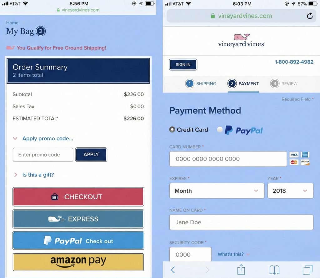
The lesson is clear: on mobile, every extra field feels like work. Every additional step is a conversion killer. Respect your users’ time by making checkout effortless.
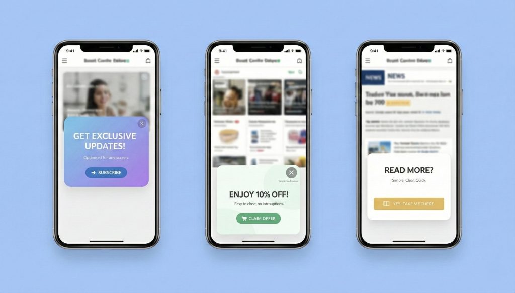
Lesson 6: Popups Kill Conversions When Misused
What works on desktop often backfires spectacularly on mobile. The most common mistakes include immediate discount popups that interrupt users before they’ve even seen your products, full-screen overlays that block content on small screens, and multiple popups stacked together like a bad joke.
Top Shopify stores are far more intentional about this. They trigger popups by behavior, not arbitrary time delays. They use slide-ups instead of full overlays that take over the entire screen. They delay popups until after meaningful engagement, and they focus on one message only. The lesson here is that interruptions feel more aggressive on mobile because there’s nowhere for users to look except at your popup. Use them sparingly, or consider not using them at all.
Lesson 7: Speed Is Everything
Mobile users are less forgiving than desktop users, and slow load equals lost sale. It’s that direct. Top Shopify stores limit heavy scripts, audit their apps regularly to remove ones that slow things down, compress images properly, and track mobile performance separately from desktop because the experience is fundamentally different.
Why this matters so much: a beautiful mobile design that loads slowly still fails. Users don’t see your beautiful design while they’re staring at a loading spinner. They see your competitor’s site instead. Speed isn’t a technical metric, it’s a conversion lever. Treat it like one.
The Mindset Shift That Changes Everything
High-performing Shopify brands share a fundamental mindset shift. They stop asking “How does this look on mobile?” and start asking “How does this feel on mobile?” That subtle change in framing leads to completely different design decisions.
They optimize for fewer decisions, not more options. They prioritize faster understanding over comprehensive information. They reduce effort at every step and increase confidence through strategic reassurance. Mobile becomes their primary design canvas, not a constraint they work around.
Your Mobile-First Reality Check
Use these questions to audit your Shopify store honestly. Can users understand what you sell within five seconds on mobile? Are your primary CTAs easy to reach with one thumb? Is the product value clear before you dive into technical specifications? Are reviews and trust signals visible without endless scrolling? Does your checkout minimize typing and surprise costs? Does your site load fast on average mobile networks, not just on your high-speed office wifi?
If you answer “no” to more than two of these questions, mobile UX is costing you revenue right now. Not theoretical future revenue—actual money walking out the door today.
The Bottom Line
Mobile-first isn’t something you “get to later” or plan for next year’s redesign. For Shopify stores today, mobile is the first touchpoint, the main decision environment, and the place where trust is earned or lost. Top Shopify stores don’t win because they have better ads or bigger budgets. They win because they respect mobile users’ time, attention, and context.
Design for thumbs, not mice. Optimize for clarity, not comprehensiveness. Remove friction relentlessly, not after you’ve added it. That’s what mobile-first really means. And if you’re not doing it, your competitors are.