Your customer is standing in her living room, wearing a headset.
She’s not looking at your website on a screen. She’s standing inside it. Your new sectional sofa is right there, full scale, photorealistic, sitting exactly where it would go if she bought it. She walks around it. Checks the arm height against her coffee table. Sits on her real couch and looks at how your virtual one fits the space.
She doesn’t need to imagine anything. She’s experiencing it.
Then she takes off the headset, opens her laptop, and visits your competitor’s site. Twod imensional product photos. A size chart. A 360-degree spin if she’s lucky. After what she just experienced, it feels like looking at a catalog from 1995.
She buys your sofa.
This isn’t science fiction. This is happening now. And the gap between the two experiences is about to become the only thing that matters.
The End of Squishing
For fifteen years, “responsive design” meant one thing: compression.
We took desktop sites and squished them onto tablets. Then we squished them further onto phones. We got really good at it. We mastered breakpoints, fluid grids, touch targets, and thumb zones.
But the fundamental paradigm never changed. Content was always trapped behind a flat sheet of glass. Users were always observers, never participants. They scrolled. They tapped. They pinched and zoomed. But they were always on the outside looking in.
That era is ending faster than most brands realize.
With Apple Vision Pro, Meta Quest 3, and the rapid advancement of mobile AR, the screen is dissolving. We’re not just changing form factors anymore. We’re changing the entire relationship between user and interface.
At PracticeNext, we’re watching the shift happen in real-time: from the “Mobile-First” era to the “Immersive-First” era. And most brands aren’t ready.
The next big UI challenge isn’t about fitting content onto a screen. It’s about placing content into the world.
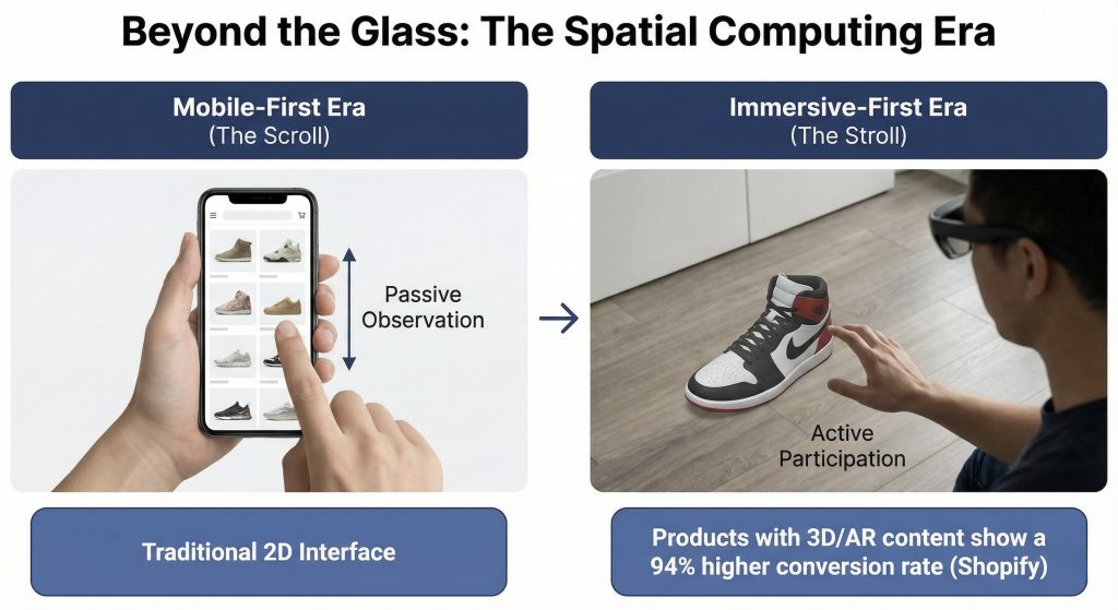
From Scroll to Stroll
In traditional mobile UI, the primary interaction is vertical scrolling. It’s passive. Linear. Constrained by the edges of a screen. In spatial UI, the primary interaction is depth.
Today’s mobile AR lets a customer point their phone at their feet to see how sneakers look on them. The UI isn’t a grid of product photos anymore, it’s a 3D object anchored to the real world, responding to lighting and perspective.
Tomorrow’s spatial computing removes the phone entirely. The customer doesn’t look at a product page. They stand next to a life-size virtual model of your product in their actual living room. They walk around it. Touch it. Place it exactly where it would go.
The difference isn’t incremental. It’s categorical.
The business case is already clear. Shopify reports that products with 3D or AR content show a 94% higher conversion rate than those without. This isn’t a gimmick for early adopters. This is the ultimate “try before you buy,” and customers are responding exactly how you’d expect: they’re buying more when they can experience products spatially.
The question isn’t whether this transition will happen. It’s whether your brand will be ready when it does.
Unlearning 2D: The New Rules
Here’s the hard part: you can’t just float a 2D website in 3D space and call it innovation. Spatial computing has completely different constraints, affordances, and expectations. You need to unlearn habits you’ve spent a decade perfecting.
1. Glass Replaces Solid Backgrounds
In 2D design, we use solid backgrounds. White. Black. Brand colors. Clean, opaque surfaces.
In spatial UI, like Apple’s visionOS, backgrounds are translucent “glass” materials that blur the real world behind them. This isn’t an aesthetic choice. It’s fundamental to the experience.
The challenge: Your text and buttons need to be readable whether the user is standing in a bright kitchen with sunlight streaming through windows or a dim bedroom at night. Static hex codes don’t work anymore.
You need adaptive contrast systems. Dynamic vibrancy settings that respond to the environment. Your carefully crafted color palette needs to become intelligent, not fixed.
Most brands’ design systems are built for controlled, predictable screen environments. Spatial computing throws all that control out the window—literally.
2. Eyes Are the New Fingers
On mobile, we design for thumbs. The “thumb zone” dictates where important buttons go. We obsess over tap targets and gesture shortcuts. In spatial computing, the eyes are the mouse.
The return of hover states: When a user looks at a button, it should respond before they click, a gentle glow, a subtle lift, a visual whisper that confirms intent. This feedback loop is essential because eye tracking is imprecise.
The precision problem: Eye tracking feels magical until you try to use it for fine motor control. Your eyes naturally jitter. They don’t hold perfectly still like a mouse cursor.
This means UI elements need massive “hit states” and generous padding. Buttons need to be bigger than you think they should be. Spacing needs to forgive slight eye movements. Dense, compact interfaces that work beautifully on mobile become unusable in spatial contexts.
3. Object Permanence Becomes Mandatory
In a 2D app, when you switch tabs, the old content disappears. We’ve trained users to expect this. Information exists in layers that replace each other. In spatial UI, users expect persistence because that’s how the real world works.
The scenario: A customer drags a virtual shopping cart window and places it on their coffee table. They walk to the kitchen to grab a drink. When they return to the living room, that cart should still be on the coffee table, exactly where they left it.
This isn’t a technical detail. It’s a fundamental expectation shift. If virtual objects don’t persist in space the way real objects do, the entire illusion collapses. The interface stops feeling like part of the world and starts feeling like a glitchy video game.
The technology: This requires anchoring UI elements to real-world coordinates, not screen coordinates. Your interface needs to understand physical space, not just pixel grids. It’s a different mental model entirely.
The Preparation Timeline: What to Build Today
Here’s the good news: you don’t need to launch a visionOS app tomorrow. But you do need to start preparing your assets today.
Because when spatial computing reaches critical mass, and it will, the brands with spatial-ready content will dominate. Everyone else will be scrambling to catch up.
Phase 1: Build Your 3D Asset Pipeline
Look at your Digital Flagship right now. It’s probably full of flat JPEGs. Product photos from multiple angles, carefully shot in controlled lighting, optimized for web delivery.
Start creating 3D models instead. Specifically, GLB and USDZ files, the formats that work across platforms.
The efficiency breakthrough: Stop doing expensive photoshoots for every single angle and color variant. Create one high-fidelity 3D model. You can render 2D photos from it for your current website and use the actual 3D file for AR experiences.
One asset, two formats, future-proof. The initial investment is higher, but the long-term efficiency is undeniable.
Start with your hero products. The bestsellers. The high-margin items. Build the pipeline now so you’re ready to scale when the platform arrives.
Phase 2: Enable Mobile AR as Your Bridge
You don’t need to wait for mass Vision Pro adoption. The bridge technology already exists in your customers’ pockets. Enable “View in Your Space” on your mobile site. Let iPhone and Android users place your products in their homes using AR on the devices they already own.
Why this matters: It trains your users to interact with products spatially. It bridges the gap between scrolling and being present. And critically, it starts generating data on how customers actually use spatial features—which products they preview, how long they engage, what correlates with conversion.
This isn’t just about adding a feature. It’s about learning the behavioral patterns of spatial commerce before your competitors do.
Phase 3: Audit for Spatial Typography
Pull up your design system. Look at your fonts.
Thin, elegant typefaces that look gorgeous on a Retina display will vibrate and disappear in VR and AR. Low contrast text that’s perfectly readable on a controlled screen becomes illegible when overlaid on unpredictable real-world backgrounds.
The action: Migrate toward medium and bold font weights. Increase letter spacing. Test your typography in high-= contrast scenarios. What looks good on glass?
This seems minor until you’re in a headset and can’t read anything. Typography isn’t decoration in spatial computing, it’s the difference between usable and broken.
The Brands That Will Win
Right now, spatial computing feels niche. Vision Pro is expensive. Adoption is limited. Most executives are watching and waiting, comfortable in the knowledge that they have time. But the transition won’t be gradual. It will be sudden.
The moment spatial devices reach a critical price point, the moment they feel as natural as putting on sunglasses—consumer behavior will flip. And brands will be divided into two categories:
Category One: Brands with spatial-ready assets, design systems built for depth, and teams who’ve been experimenting for years. They’ll launch rich, immersive experiences immediately. Customers will prefer them because the experience is dramatically better.
Category Two: Brands scrambling to retrofit 2D websites into 3D space. Their experiences will feel flat, clunky, like someone ported a 2003 Flash website to mobile in 2014. Customers will notice, and they’ll shop elsewhere.
The gap between these categories won’t be about who has better technology. It’ll be about who started preparing when it still felt early.
The Window, Not the Boundary
The screen was never the destination. It was always just a limitation we accepted because we didn’t have an alternative.
Now we do.
The brands that win the next decade won’t just have the fastest mobile sites or the most responsive layouts. They’ll be the ones that invite customers inside—that collapse the distance between looking at a product and experiencing it.
The transition from “looking at” to “being with” is the most profound UI shift since the touchscreen. And unlike the mobile transition, where everyone had years to adapt, this one will move faster.
Because once customers experience spatial commerce—once they’ve placed your sofa in their living room at full scale, walked around it, and seen exactly how it fits—they won’t want to go back to guessing from 2D photos.
The screen isn’t a boundary anymore. It’s a window.
And the window is opening.