You found the perfect product. Right size. Right color. Right price. You click “Add to Cart.”
And you wait.
The spinning wheel appears. One second. Two seconds. Three seconds. Your thumb hovers over the back button. Maybe the site crashed. Maybe you should try Amazon instead. Maybe…
The item finally drops into your cart. But the moment is gone. The friction broke the spell. You’ll probably f inish this purchase. But you’re definitely not coming back. You just lost a customer you technically converted.
Here’s the brutal truth: you can build the most beautiful design system in the world. You can implement cutting-edge AI personalization. You can optimize your backend until your Lighthouse score is perfect.
But if your interface feels slow, none of it matters.
In the digital economy, speed isn’t just a technical metric. It’s the currency of trust. And most brands are optimizing for the wrong kind of speed.
The Gap Between Fast and Feels Fast
Most CTOs and technical teams obsess over what we’ll call Technical Performance. They shave milliseconds off server response times. They optimize database queries. They compress images. They chase a perfect Google Lighthouse score.
This work matters. But it’s only half the equation.
Because users don’t experience your code. They experience your interface. And there’s a profound, exploitable difference between a site that is technically fast and a site that feels fast.
At PracticeNext, we call this Perceived Performance, the psychology of speed. It’s about using UI and UX patterns to manage the user’s perception of time, ensuring the interface feels responsive even when the network is struggling.
You can’t always control your user’s internet connection. But you can absolutely control how they perceive the wait.
The Biology of Impatience
Let’s talk about why this matters at the neurological level.
Human brains perceive an action as “instantaneous” if the response occurs within 400 milliseconds. That’s the threshold where cause and effect feel connected. But to achieve true flow, where the interface feels like an extension of your hand rather than a separate system you’re commanding, you need to respond in under 100 milliseconds.
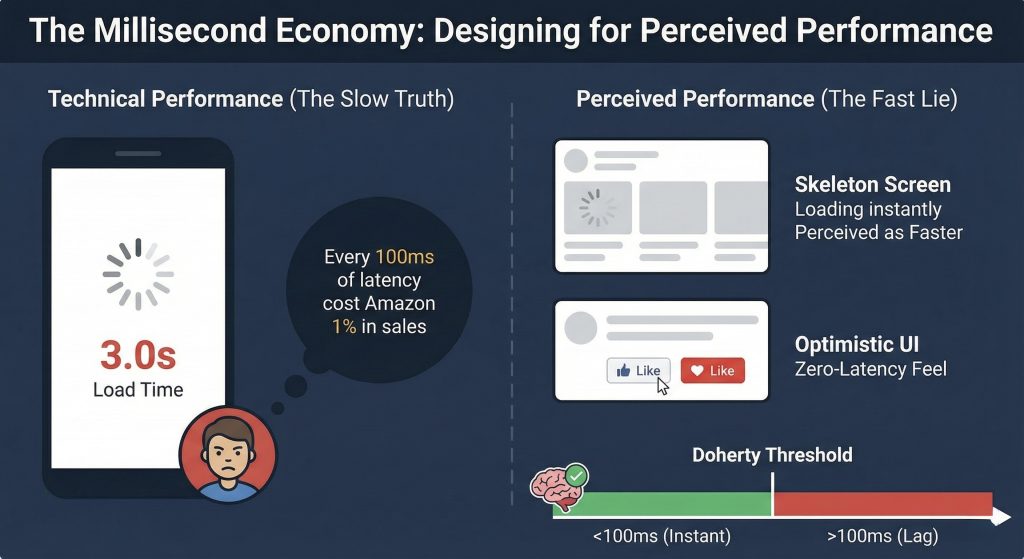
This isn’t arbitrary. It’s the Doherty Threshold, a foundational UX principle backed by decades of research.
Once you cross that 100ms threshold, something changes in the user’s brain. They mentally disconnect. The device stops feeling like an extension of their body and starts feeling like a machine they’re waiting on.
The damage compounds: That classic Amazon study everyone cites, found that every 100ms of latency cost them 1% in sales. One percent might not sound catastrophic, until you do the math on your annual revenue. If you’re doing $10 million a year, a 300ms delay is costing you $300,000.
The modern measurement: Google recently replaced page load speed with INP (Interaction to Next Paint) as a Core Web Vital. They don’t care how fast your page loads anymore. They care how fast your page responds after someone clicks a button.
That shift tells you everything about where user expectations have moved. Your Digital Flagship can load in two seconds, but if the “Add to Cart” button feels laggy, you’re hemorrhaging revenue.
The Toolkit: How to Cheat Time
You can’t always make things faster. But you can almost always make things feel faster.
Here are three psychological strategies that manipulate time perception, ethically, effectively, and with measurable impact on conversion.
1. Skeleton Screens: The Illusion of Progress
The loading spinner, that rotating wheel of death, is killing your conversions.
Why? Because it draws attention to the fact that the user is waiting. It’s a neon sign that says “NOTHING IS HAPPENING YET.” The user’s brain fixates on it. Time slows down. Frustration builds.
The fix: Skeleton screens.
Instead of a blank page with a spinner, show a gray, pulsing outline of the content structure immediately. Image placeholders. Text line placeholders. The ghost of the page that’s about to appear.
Why it works: It reduces cognitive load. The brain gets a preview of what’s coming, which creates a sense of progress even though nothing has actually loaded yet. Studies show users consistently perceive skeleton screens as loading faster than spinners, even when the actual load time is identical.
You’ve experienced this: Open LinkedIn right now. Or YouTube. Or any modern app. You see those gray bars instantly. Content fills in a moment later. But you never feel like you’re waiting for the page to “start”—it feels like the page is already there, just finishing up.
The perceived difference is massive. The technical difference is essentially zero. That’s the power of managing perception.
2. Optimistic UI: Respect Intent Immediately
Traditional UI design is pessimistic. It assumes failure until proven otherwise.
User clicks “Like” → App sends request to server → Server confirms → App updates UI.
The result? A sluggish, disconnected experience where every action requires a round-trip conversation with a server before anything happens.
Optimistic UI flips the script:
User clicks “Like” → App updates UI instantly → App sends request to server in background → If server fails (rare), quietly revert with error.
Why it works: It respects the user’s intent immediately. The interface responds at the speed of human expectation, instantaneous. The server confirmation happens in the background where the user doesn’t need to think about it.
And here’s the key: 99% of the time, these actions succeed. The server confirms what the UI already showed. The user never knows there was a delay. They just experienced a zero-latency interaction.
You use this every day: Instagram likes turn red instantly. Trello cards move the moment you drag them. Modern “Add to Cart” buttons provide immediate visual feedback. None of these wait for server confirmation before responding.
The failure rate is low enough that the occasional need to revert is vastly outweighed by the perception of speed 99 times out of 100.
3. Functional Animation: Turn Waiting Into Watching
Motion isn’t just decoration. It’s a time manipulation tool.
If a process genuinely takes two seconds, processing a payment, uploading a photo, confirming an order, showing a static screen makes those two seconds feel like ten.
The tactic: Use animation to occupy the brain during unavoidable waits.
When a user completes a purchase, don’t show “Processing…” with a spinner. Show an animation of a shopping bag being wrapped. Or a checkmark drawing itself with satisfying flair. Or a progress bar that moves through meaningful stages: “Confirming payment → Updating inventory → Preparing confirmation.”
The psychology: This turns “waiting time” into “watching time.” The user is entertained, so the duration feels shorter. Their attention is directed toward progress rather than delay.
The master class: Uber does this brilliantly. While you wait for a driver to accept your ride, you’re not staring at a spinner. You’re watching the car icon move on a map, seeing driver photos animate in, getting real-time updates. The wait is the same, but it doesn’t feel like waiting. It feels like something is actively happening.
Functional animation respects both the technical reality (this takes time) and the psychological reality (people hate feeling idle).
From Audit to Action
Theory is useless without implementation. Here’s how to actually fix your perceived performance.
Step 1: Audit Your INP
Go to Google Search Console right now. Look at your Core Web Vitals report. Find your Interaction to Next Paint (INP) score.
If it’s over 200ms, your site feels laggy to users. If it’s over 500ms, you’re actively driving people away. Get the baseline data so you know what you’re fighting.
Step 2: Kill Every Spinner
Go through your site with fresh eyes. Identify every loading state. Every place where a user action triggers a wait. Home page. Product pages. Cart. Checkout. Search results.
Replace every standard spinner with a skeleton screen that matches your actual layout. This is where Atomic Design pays off, you can create skeleton versions of your organisms and molecules that appear instantly while content loads.
Step 3: Go Optimistic on High-Frequency Actions
Work with your development team to implement optimistic UI on the actions users perform most:
- Adding items to wishlist
- Adding items to cart
- Updating quantities
- Liking or favoriting
- Following or subscribing
These should all feel instant. Update the UI immediately. Handle server confirmation in the background. Show an error only if something actually fails.
Step 4: Add Functional Animation to Unavoidable Waits
Identify processes that genuinely can’t be instant, payment processing, account creation, order confirmation. These are your opportunities for functional animation.
Create custom loading states that communicate progress and occupy attention. Make them on-brand. Make them delightful. Make waiting feel like progress.
The Competitive Advantage Hiding in Plain Sight
Here’s what most brands miss: perceived performance is a massive, underutilized competitive advantage.
Your competitors are obsessing over technical speed. They’re paying developers to optimize database queries and CDN configurations. That work is necessary but insufficient.
Meanwhile, their interfaces still feel slow because they haven’t addressed the psychology.
You can leapfrog them without having faster servers. You just need to respect how human brains actually experience time.
When a customer uses your site and it feels instantly responsive, buttons react immediately, pages show content fast, processes feel alive rather than stuck, they develop a subconscious trust. This place works. This place is reliable. This place respects my time.
When they use your competitor’s site and click “Add to Cart” only to watch a spinner for two seconds, they form the opposite impression. Even if the technical performance is identical.
One site feels premium. The other feels janky. The difference isn’t in the code. It’s in the perception.
The Real Speed
You’ve built a Digital Flagship. You’ve invested in modern architecture, AI personalization, and cutting-edge features.
Don’t let a spinning wheel destroy all that value.
In the millisecond economy, friction is the ultimate conversion killer. You can have the best product, the smartest merchandising, and the most beautiful design. But if your interface feels slow, you lose.
The shift from “server speed” to “perceived speed” isn’t about cheating or lying. It’s about respecting how humans actually experience technology.
Customers don’t experience code. We don’t see database queries. We don’t care about Lighthouse scores.
Customers experience feeling. And when an interface feels fast, when it responds instantly to our intent, shows us progress immediately, and occupies our attention during unavoidable waits, we trust it.
We buy from it. We return to it. We recommend it.
Your Digital Flagship doesn’t just need to function. It needs to flow.
And flow happens in the first 100 milliseconds.


Pingback: From Static Pages to Sentient Systems, Future of UI - ThinkNext