A 19 year old sneaker-head lands on your site looking for limited edition high tops. A 52 year old executive lands on the same site looking for comfortable running shoes for his morning routine.
Your site shows them the exact same homepage. The exact same navigation. The exact same grid of products.
One of them bounces. Probably both.
For twenty years, eCommerce has been frozen in time. The architecture hasn’t fundamentally changed since Amazon pioneered it: Homepage → Category → Filter by size/color → Scroll grid → Click product.
It’s a digital catalog. It assumes every customer wants to do the same work, sorting through filters, hunting through grids, translating their actual needs into awkward keyword searches. Whether you’re a Gen Z fashion enthusiast or a baby boomer shopping for the first time, the interface treats you identically.
In the age of AI, this one size fits all approach isn’t just outdated. It’s a competitive liability.
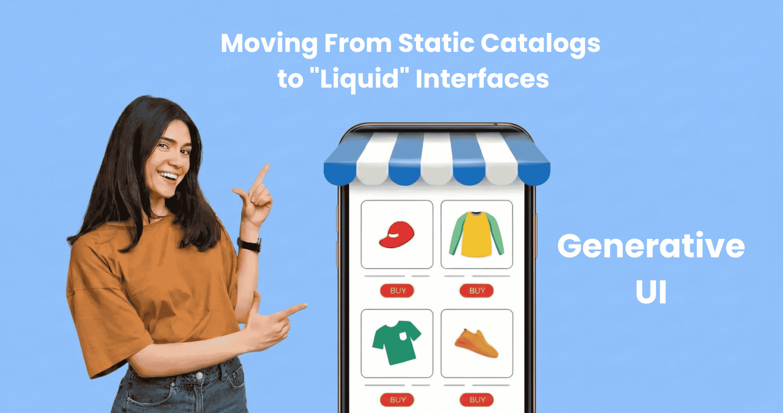
At PracticeNext, we’re watching the emergence of something fundamentally different: Generative UI. Not just personalization in the old sense “Welcome back, Tarun” but truly liquid interfaces that assemble themselves in real time, adapting their entire layout, content, and merchandising to match each user’s intent.
The interface doesn’t just greet you differently. It becomes something different.
The Expensive Problem You’re Not Tracking
Let us show you what’s breaking.
A customer searches your site for “summer wedding guest dress not too short.” She’s being specific. She knows what occasion. She knows the season. She knows her constraint.
Your traditional keyword search returns zero results. Or worse, it returns every dress you sell, completely ignoring the nuance of her query. She leaves. You just lost a sale to filter fatigue.
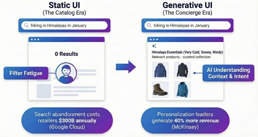
Google Cloud estimates that search abandonment costs US retailers $300 billion annually. That’s not a typo. $300 billion in abandoned intent because keyword search is fundamentally brittle. It can’t understand context. It can only match exact strings.
Then there’s the paradox of choice. Baymard Institute research consistently shows that overwhelming customers with options, 50 filters, 200 products in a grid, is a top driver of cart abandonment. You thought you were being helpful by giving them control. You actually just gave them homework.
The interface makes the customer do all the cognitive work. Translate your needs into keywords. Apply the right combination of filters. Scroll through endless grids. Figure out which product actually solves your problem.
It’s exhausting. And your competitors who fix this will win your customers.
From Search Bar to Conversation
The breakthrough isn’t better search. It’s a different paradigm entirely.
Generative UI moves the experience from “search” to “consultation.” It uses Large Language Models and vector search to understand intent, not just match keywords.
Here’s the difference:
A customer types: “I’m going hiking in Himalayas in November. What do I need?”
Your current site: Zero results. Your database contains no product named “Himalayas November hiking.”
Generative UI: The system understands what that query actually means. Patagonia in November means cold, windy, potentially rainy. High elevation. Variable conditions.
It doesn’t show you a search results page. It dynamically creates a collection called “Himalayas November Essentials.” Windproof shell jackets. Thermal base layers. Waterproof hiking boots. Packable rain gear. Maybe a warm beanie. Everything prioritized by relevance to the actual use case.
The customer doesn’t need to know your category taxonomy. They don’t need to apply filters. They stated their need in natural language, and the interface assembled itself around that need.
This isn’t science fiction. The technology exists today. Vector search engines can understand semantic meaning. LLMs can interpret context. The question is whether you’re using them.
The Interface That Shapeshifts
But Generative UI goes further than smart search. It changes the entire layout based on who’s looking.
Imagine two people land on your product page for a cordless drill.
Person A is a B2B procurement manager. She’s buying thirty drills for a construction company. She needs to justify this purchase to finance.
Person B is a weekend DIY hobbyist. He’s building a deck. This is his first cordless drill. He has no idea what “torque settings” mean.
On today’s eCommerce sites, they see identical pages. Same hero image. Same description. Same layout. One size fits nobody well.
With Generative UI, the page adapts:
Person A’s version prioritizes the technical specifications table at the top. Bulk pricing calculator. Warranty details. A “Download PDF Spec Sheet” button for her procurement file. The lifestyle video is hidden or pushed down, she doesn’t care about weekend warriors in flannel shirts.
Person B’s version leads with the “How-To Video” showing the drill in action. User reviews from other first time DIYers. A “Frequently Bought Together” bundle showing drill bits and safety glasses. The bulk pricing table? Hidden. It’s irrelevant and intimidating.
Same product. Same URL. Completely different interface.
McKinsey reports that companies excelling at this kind of personalization generate 40% more revenue from those activities than average players. This isn’t about being nice to customers. It’s about yield showing each person the version of your site where they’re most likely to buy.
The Netflix Moment for Commerce
You’ve already experienced this in entertainment.
Netflix doesn’t just recommend different movies to different users. It shows you different artwork for the same movie based on your viewing history.
If you watch romantic dramas, the thumbnail for Good Will Hunting shows Matt Damon and Minnie Driver in an intimate moment. If you watch comedies, the thumbnail shows Robin Williams making someone laugh. Same movie. Different hooks.
Generative UI brings this to commerce.
A luxury handbag brand has a new season release.
Customer A (Trend Hunter): Lands on a page where the hero image shows the bag on a runway model. Fashion forward styling. The headline reads “Exclusive Season Drop Limited Availability.” The urgency angle.
Customer B (Utility Shopper): Lands on what appears to be a different page. Same bag, but the hero image is a detailed shot of the interior organization, pockets, compartments, laptop sleeve. The headline reads “Everyday Functionality Meets Timeless Design.” The practical angle.
The product hasn’t changed. The interface understood what would resonate and reconfigured itself accordingly.
This is what “liquid” means. The interface flows into the shape of each user’s motivation.
Starting Without Burning It Down
Here’s the good news: you don’t need to rebuild your entire frontend tomorrow. Generative UI can be implemented progressively, starting with high-impact zones.
Phase 1: Fix Search First
Move from keyword matching to vector search. Tools like Algolia AI Search or Constructor.io can plug into your existing platform.
The immediate win: no more “zero results” pages. When someone searches “cozy sweater for cold office,” the system understands “warm,” “soft,” “professional” and returns relevant results even if you never tagged anything with those exact words.
This alone can recover a significant portion of that $300 billion in search abandonment.
Phase 2: Add a Consultative Module
Pick your highest-traffic landing page, maybe your homepage or your bestselling category.
Instead of a static hero banner, implement a “Product Matchmaker” interface powered by AI. It asks smart questions in natural language. “What’s the occasion?” “What’s your style preference?” “Any specific concerns?”
Based on the answers, it dynamically filters and sorts the product grid below. The user feels guided instead of overwhelmed. The conversion rate on that page will tell you everything you need to know about whether this works.
Phase 3: Make Product Pages Dynamic
This requires headless architecture (which is why we’ve been advocating for it all along).
Tag your content blocks by persona: Technical Specs (for B2B), Lifestyle Video (for aspirational buyers), Sustainability Story (for conscious consumers), Reviews (for skeptics).
Use signals, referral source, browsing behavior, past purchases, to serve the right blocks to the right visitor. Your analytics will tell you which signals correlate with conversion, and you optimize from there.
You don’t flip a switch and make everything generative overnight. You test, learn, expand. Each phase builds on the previous one.
The Interface That Thinks
Here’s what’s really happening underneath all of this.
Traditional eCommerce says: “Here’s our catalog. Good luck finding what you need.” Generative UI says: “Tell me what you’re trying to accomplish, and I’ll show you exactly what matters.”
One treats customers like researchers who should learn your taxonomy and do their own filtering. The other treats them like humans with goals who deserve an interface that does the cognitive work for them.
We’re moving from the catalog era to the concierge era.
Your customers are not impressed that you have 10,000 SKUs anymore. They’re overwhelmed. They don’t want more choices, they want the right choice, surfaced intelligently.
The brands winning in 2026 won’t be the ones with the biggest product catalogs. They’ll be the ones whose interfaces are smart enough to feel like they’re reading minds.
Static grids worked when online shopping was novel and customers were patient. Those days are gone. Your 19 year old sneaker-head and your 52 year old executive both expect interfaces that understand them.
The technology is ready. The question is whether your organization is ready to stop showing everyone the same thing.
Because the moment your customer lands on a site that adapts to them, that understands their query, configures itself around their needs, and guides them effortlessly to the right product, your static catalog starts to feel like a museum.
And museums are places people visit to see how things used to be. Not where they go to buy.
We create scalable, mobile-first experiences that seamlessly blend your brand’s narrative, visual identity, and user experience across every channel. By forging deep emotional bonds, our designs transform your casual visitors into devoted brand advocates.


Pingback: Scaling Design Intelligence Through Prompt Engineering I PracticeNext
Pingback: From Static Pages to Sentient Systems, Future of UI - ThinkNext
Pingback: State of Digital Commerce UX 2026 | White Paper I PracticeNext