
Picture this: You’ve spent hours perfecting your Shopify store, invested in ads bringing hundreds of daily visitors, and you refresh your analytics expecting orders. Instead, you see ghosts visitors who browsed for thirty seconds and vanished.
If this sounds familiar, you’re living a story thousands of merchants know. The instinct is to blame the ads or tweak the SEO. But the problem isn’t getting people through the door. It’s what happens when they walk in.
The Moment Everything Goes Silent
Imagine watching a customer enter your store, glance around searching for something that tells them they’re in the right place, then turn and leave after a few confused seconds.
This happens thousands of times daily on Shopify stores. The pattern is always the same: visitors expect one thing and encounter something different. They clicked an ad about solving a problem, but your homepage greets them with abstract brand statements and artistic photos. Within seconds, they think: “Wait, what is this place?” And they’re gone.
The Journey That Makes or Breaks Everything
A visitor needs to understand what you’re selling, figure out if your product solves their problem, trust you enough to share payment details, then complete purchase without obstacles. Most stores create friction at every step.
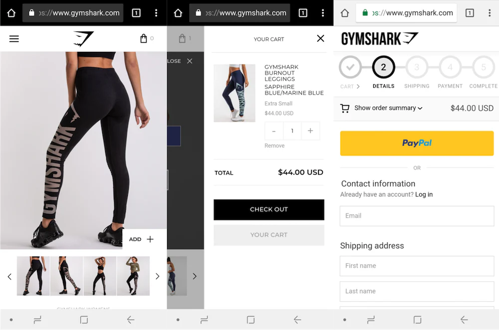
Gymshark understood this. When you land on their site, there’s no guessing game. Within seconds, you know they serve people serious about fitness with performance gear. Real athletes in training scenarios. Headlines about aspiration and utility, not vague lifestyle talk. It’s not magic, it’s clarity delivered at the speed of human intelligence.
When Features Become White Noise
The product page is where things often collapse. A visitor clicks on something interesting, and now they’re asking: “Will this actually work for me?” Instead of answering, many stores list specifications, dimensions, materials, technical features that mean nothing to someone solving a problem.
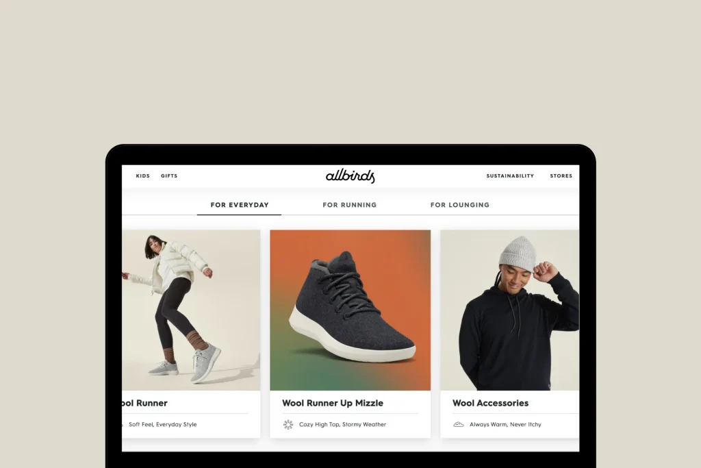
Allbirds understood something fundamental: people don’t buy shoes because they’re made from merino wool. They buy comfort and sustainability. So that’s what Allbirds shows you immediately, with benefits leading and features supporting. The story is always about how your life changes, not what the product is made of.
The Trust Tax
Even with clear messaging, there’s still a hurdle: trust. Every online purchase is a leap of faith. Beautiful design can’t pay this tax. Only proof can.
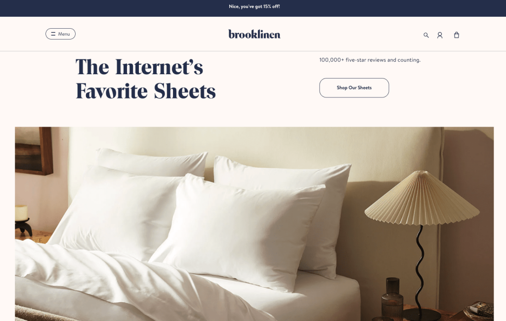
Brooklinen sprinkles proof throughout the journey. Customer reviews are woven into browsing. Real photos from real customers show sheets in actual bedrooms. Return policies appear right where hesitation sets in. This isn’t about having more trust signals, it’s about placing them where doubt naturally arises.
The Mobile Mistake
Most traffic comes from phones, yet many stores treat mobile visitors like second-class citizens. Picture someone on a subway with thirty seconds of attention. Your button is tiny. Descriptions scroll forever. A popup blocks the screen. They’ll never reach checkout.
Stores that convert mobile traffic understand it’s an entirely different behaviour. Thumbs move quickly. Every additional tap loses someone. High-performers use sticky add-to-cart buttons, concise copy, and stripped-down navigation.
When Winning Becomes Losing
Someone has decided to buy from you. They’ve overcome confusion, doubt, and mobile friction. They click through to checkout then see shipping costs for the first time. Or they’re forced to create an account. Or face a form asking for fifteen pieces of information. And they abandon their cart.
Checkout should feel like confirmation, not interrogation. The best stores offer guest checkout immediately, showcase express payment options, keep pricing transparent from the start, and display security badges. These aren’t revolutionary tactics, just the removal of unnecessary friction when friction is most lethal.
The App Trap
Shopify offers thousands of apps promising conversion boosts. The temptation is to install them all. The result: popups, countdown timers, notification bars, chatbots, and overlays all competing for attention simultaneously.
Successful stores use apps surgically, not liberally. They add tools only when they reduce friction or add clarity. Every few months, they audit and ruthlessly remove anything that doesn’t directly support the purchase path.
What the Winners Understand
Gymshark, Allbirds, and Brooklinen share a principle: reduce cognitive barriers at every step. Gymshark aligned everything with audience aspirations. Allbirds paired minimalist design with benefit-led messaging. Brooklinen integrated trust into browsing, not just checkout.
They’re not succeeding because they’re pretty. They’re succeeding because buying feels obvious, not complex.
Next Chapter for your Brand
Start by diagnosing where visitors leave. Use analytics to find drop-off points. Watch session recordings to see where confusion sets in.
Then prioritize ruthlessly. Fix clarity first can a visitor explain what you sell in ten seconds? Address trust, have you given enough proof? Tackle mobile third, is it built for thumbs, not cursors? Test everything. Let data tell you what works, not assumptions.
Conversion Is a UX Problem Disguised as Marketing
Most Shopify stores don’t fail because ads never brought visitors. They fail because visitors never feel confident enough to buy. The solution isn’t more traffic, it’s better experience, better clarity, and better trust.
Make the buying decision obvious, not complex. That’s when conversions stop being a mystery, and start becoming your strength.